udemy html5 css3
browser
request
https://omnifood.de
web server
response
html css js
static website: website where files are simply sent to browser as they are
front end development
dynamic website: website files are assembled on the server
back end development
webserver app db
back-end languages that run on servers
html -> content -> nouns
css -> presentation -> adjectives
js -> programming language: dynamic effects and web applications -> verbs
HTML fundamentals
introduction to html
html: hypertext markup language
html is a markup language that web developers use to structure and descripe the content of a webpage(not a programming language)
html consists of elements that describe different types of content: paragraphs, links, headings, images, video, etc.
web browsers understand html and render Html code as websites
<p>HTML is a markup language</p>

<p>opening tag: name of the element, wrapped in < and >content: content of the element, in this example text. but it might be another element(child element). some elements have no content(e.g.
<img>)</p>closing tag: same as opening tag, but with a /. when element has no content, it’s omitted.
HTML document structure
1 |
|
text elements
<em></em>emphersized
lists
images and attributes
hyperlinks
Structure our page
semantic html
css fundamentals
cascading style sheets
css describes the visual style and presentation of the content written in HTML
css consists of countless properties that developers use to format the content: properties about font, text, spacing, layout, etc.
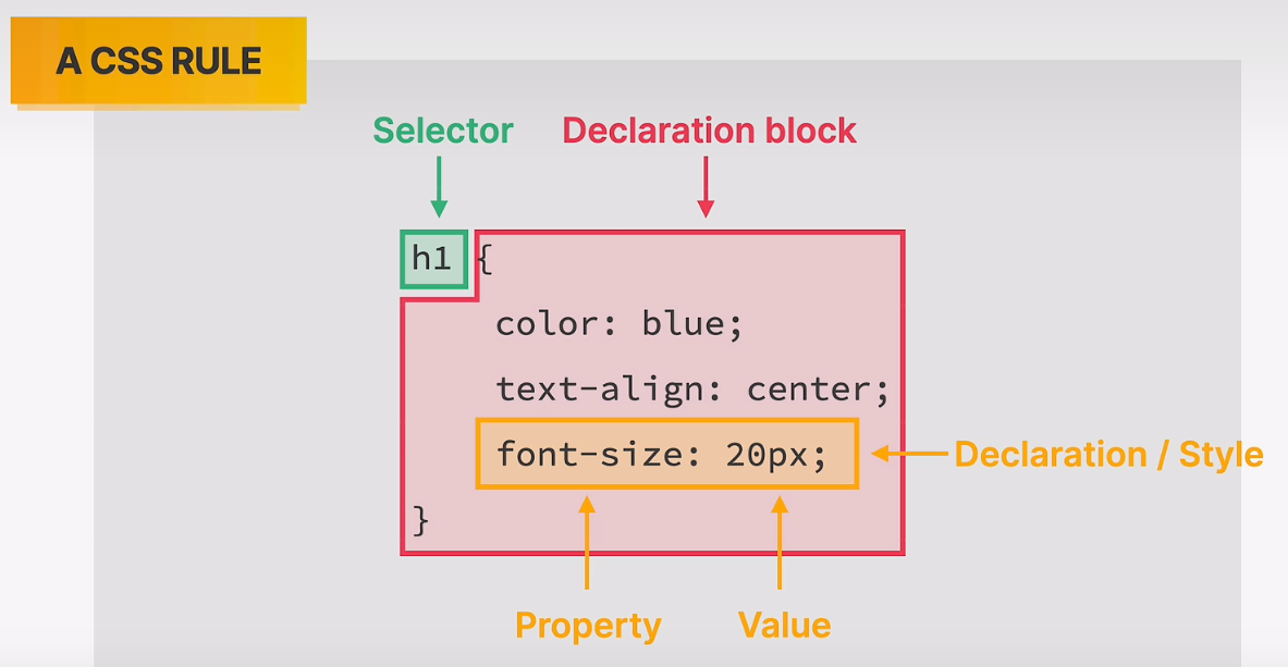
inline, internal and external css
styling text
16px default
combining selectors
working with colors
rgb(12,125,255)
rgba(0,255,255,0.3)
#00ffff#0ff when allcolors are identical pairs
when colors in all 3 channels are the same, we get a gray color
pseudo class
using chrome devtools
conflicts between rules
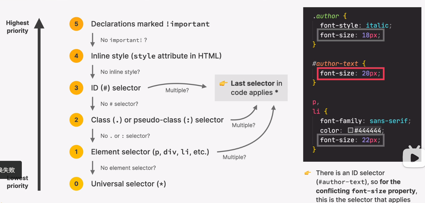
multiple -> last selector in code applies
marked !important
inline style
id selector
class or pseudo class selector
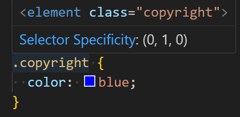
element selector
universal selector (*)
inheritance and the universal selector
css box model
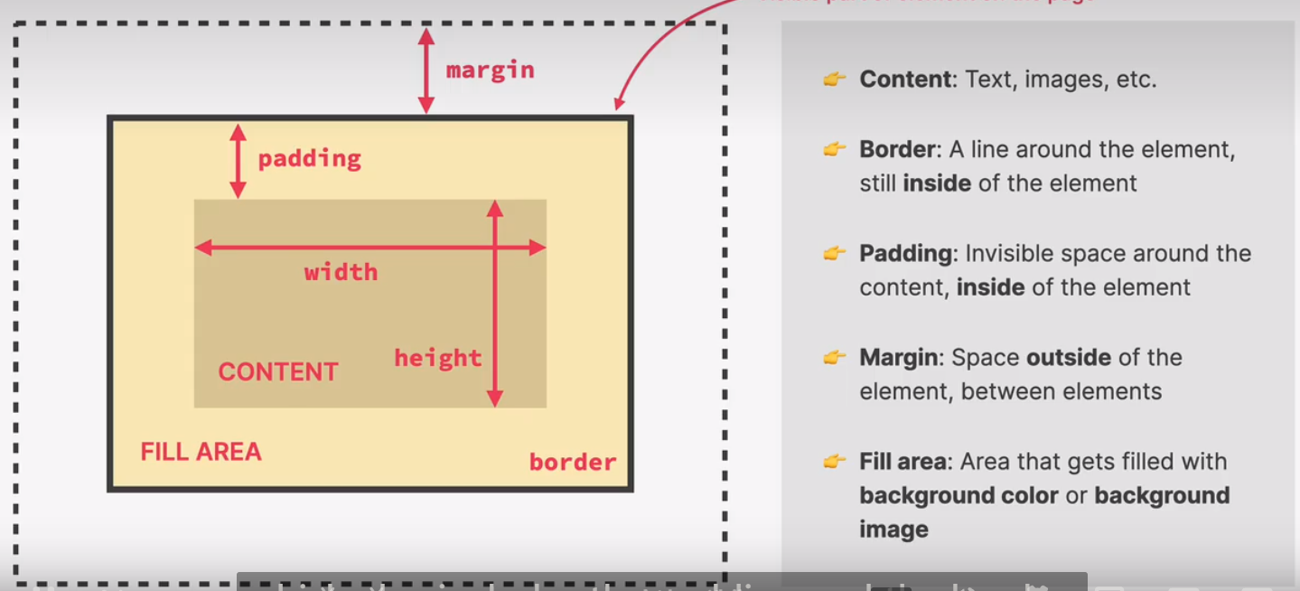
margin and padding
clapping of margins
adding dimention
centering our page
class container
1 | .container { |
types of boxes
- inline elements
occupies only the space necessary for its content
causes on line-break after or before the element
box model applies in a different way: heights and widths do not apply
paddings and margins are applied only horizontally(left and right)
a
strong
em
button
with css
display: inline
- block level elements
elements are formatted visually as blocks
elements occupy 100% of parent element’s width, no matter the content
elements are stacked vertically by default, one after another
the box-model applies as showed earlier
with css
display: block
- inline block boxes
looks like inline from the outside, behaves like block-level on the inside
occupies only content’s space
causes no line-breaks
box-model applies as showed
img
with css
display: inliblock
absolute positioning
normal flow
in flow: laid out according to their order in the html code
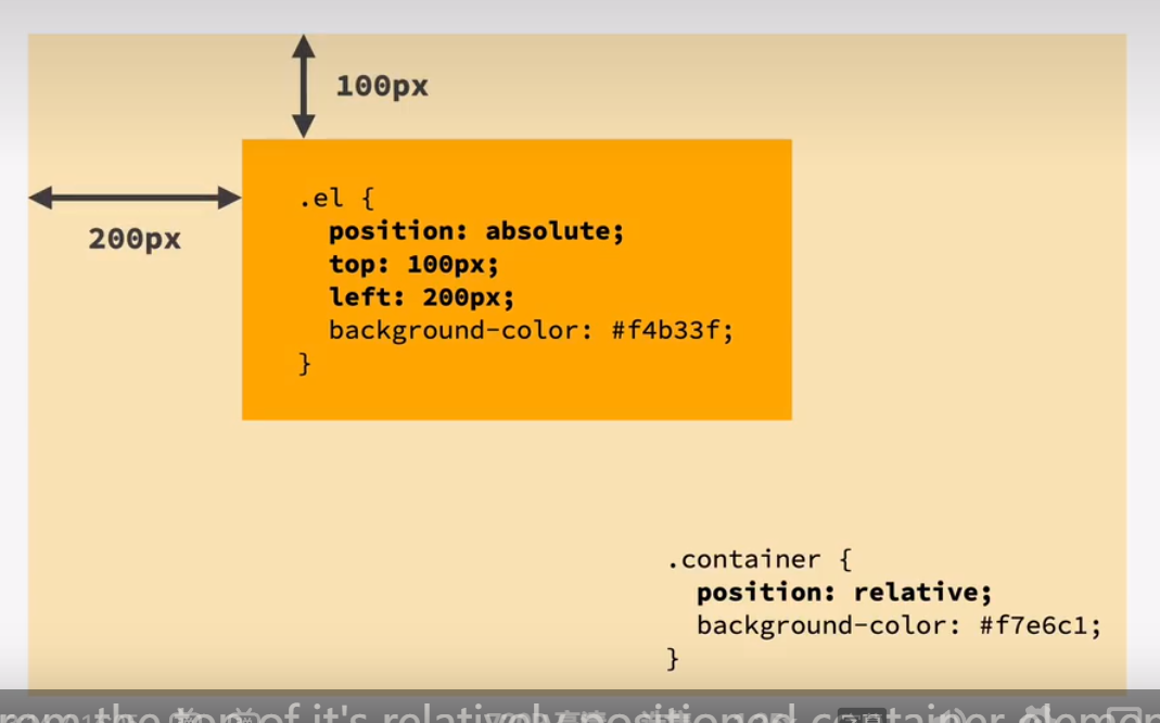
absolute positioning
out of flow: no impact on surrounding elements, might overlap them
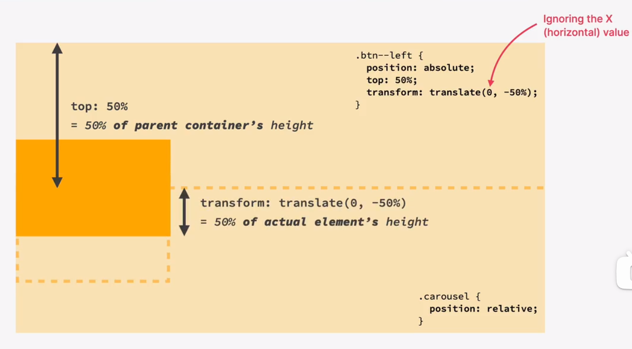
use top, bottom, left, or right to offset the element from its relatively positioned container(the first)
pseudo elements
+
adjacent sibling
sibling right after the element
googling and reading documentation
debugging and asking questions
chrome dev tool
font-size
arrow
shift arrow
challenge #3
the 3 ways of building layouts
layout is the way text, images and other content is placed and arranged on a webpage
layout gives the page a visual structure, into which we place our content
building a layout: arranging page elements into a visual struture, instead of simply having them placed one after another(normal flow)
page layout
component layout
- float layouts
old way
element is removed from the normal flow: “out of flow”
text and inline elements will wrap around the floated element
the container will not adjust its height to the element
flexbox
laying out elements in a 1-dimensional row without using floats. perfect for componnet layoutscss grid
for laying out element in a fully-fledged 2-dimentional grid. perfect for page layouts and complex componnets.
using floats
both children float
collapse of the elements
clearing float
box-sizing: border-box

challenge #1
introduction to flexbox
tall as the tallest
a flexbox overview
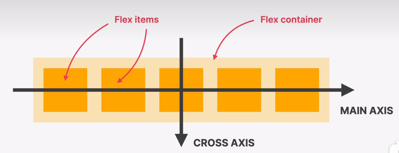
flexbox is a set of related css properties for building 1 dimentional layout
the main idea behind flexbox is that empty space inside a container element can be automatically divided by its child elemennts
flexbox makes it easy to automatically align items to one another inside a parent container, both horizontally and vertically
flexbox solves common problems such as vertical centering and creating equal-height colums
spacing and aligning flex items
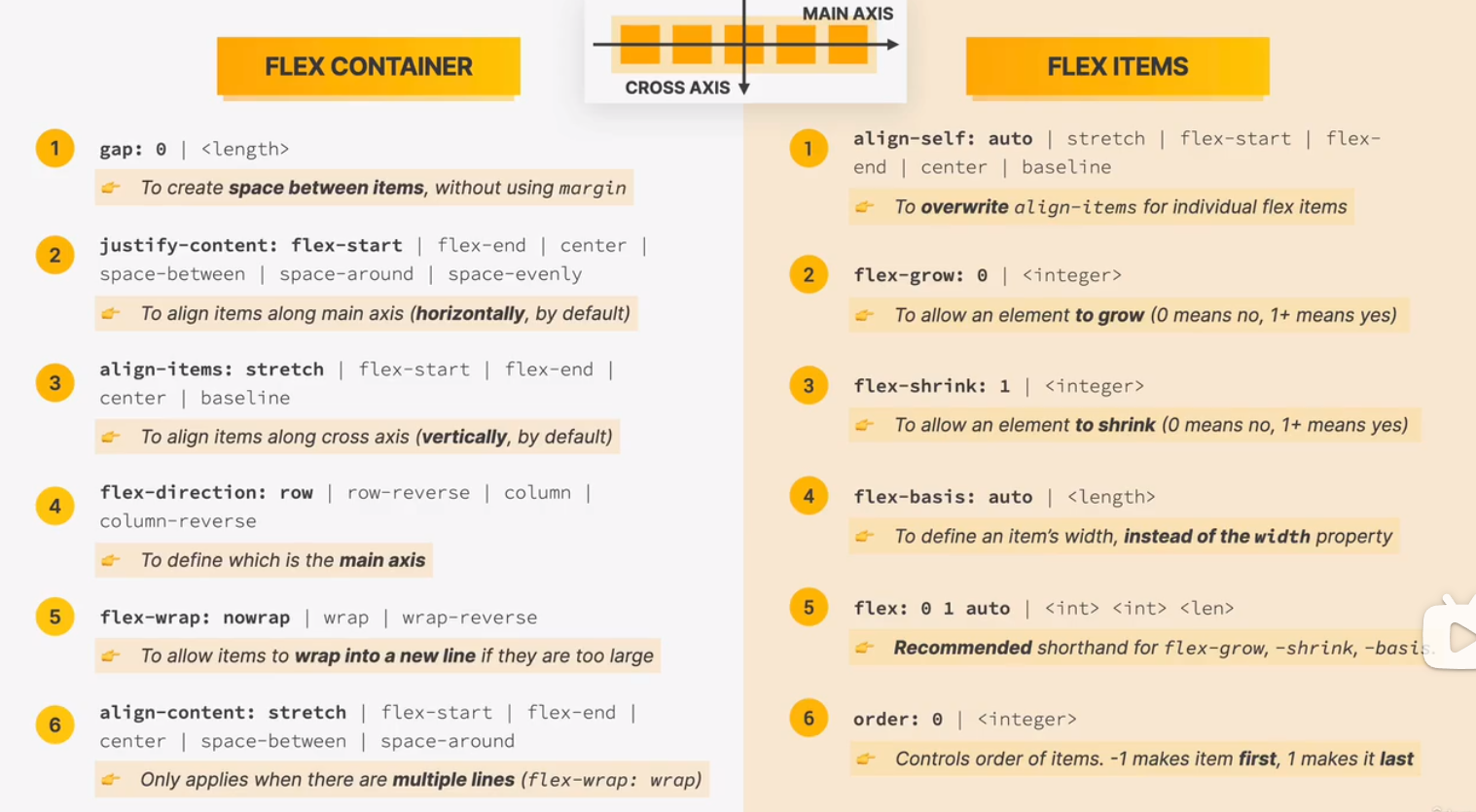
the flex property
add flexbox to our project
building a simple flexbox layout
challenge #2
introduction to css grid
a css grid overview
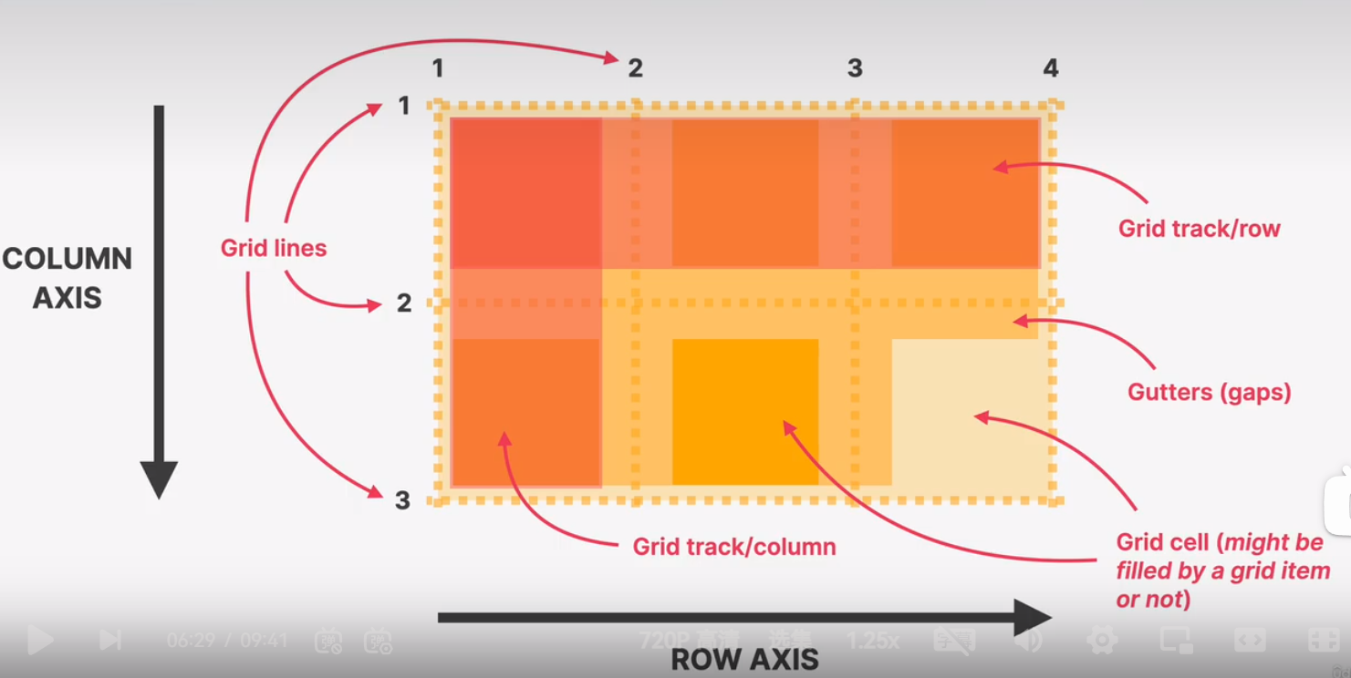
css gird is a set of css properties for building 2-dimentional layouts
the main idea behind css grid is that we divide a container element into rows and columns that can be filled with its child elements
in two-dimentional contexts, css grid allows us write less nested html and easier to read css
css grid is not meant to replace flexbox! instead, they work perfectly together. need a 1d layout? use flexbox. need 2D layout? use css gird
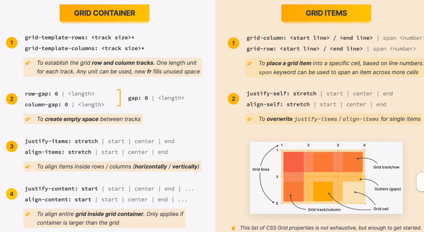
sizing grid columns and rows
fr fraction
placing and spanning grid items
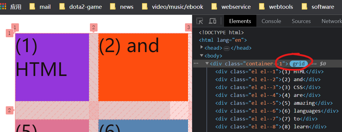
aligning grid items and tracks
building a simple css grid layout
challenge #3.0
web design rules and framework
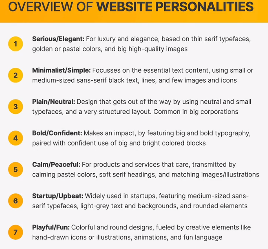
overview of web design and website personalities
ingredients
typography
colors
images/illustrations
icons
shaows
border-radius
whitespace
visual hierarchy
user experience
componnets/layout
rule #1 typography
serif
sans-serif
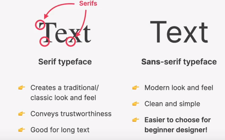
use only good and popular typefaces and play it safe
its okay to use just one typeface per page! if you want more, limit to typefaces.
choose the right typefaced according to your website personality:
choose the right personality for your website
- decide between a serif and sans-serif typeface
- experiment with all the “good” typefaces(and other typefaces from google fonts!) to see which ones best fits your websites message
- keep trying different typefaces as you design and build the page
use good font sizes and weights
- when choosing font-sizes, limit choices! use a “type scale” tool or other pre-defined range
- use a font size between 16px and 32px for normal text
- for long text (like a blog post), try a size of 20px or even bigger
- for headlines, you can go really big (50px+) and bold (600+), depending on personality
- for any text, dont use a font weight under 400 (regular)
create a good reading experience
- use less than 75 character per line
- for normal-sized text, use a line height between 1.5 and 2. for big text, go below 1.5
- the smaller or longer the text, ther larger the line height needs to be!
- decrease letter spcing in headlines, if it looks unnatural(this will come from experience, if the headline looks not nature)
- experiment with all caps for short titles. make them small and bold and decrease letter spacing
- usually, dont justify text(每行平铺)
- dont center long text blocks. small blocks are fine.
rule # colors
choose the right color
- make the main color match your website’s personality: colors covey meaning!
- red drawing a lot of attention, and symbolizes power, passion, and excitment
- orange is less aggressive, and conveys hapiness, cheerfulness, and creativity
- yellow means joy, brightness and intelligece
- greens represents harmony, nature, growth, and health
- blue is associated with peach, trustworthiness and professionalism
- purple conveys wealth, wisdom, and masic
- pink represents romance, care and affection
- brown is associated with nature, durability and comfort
- black symbolizes power, elegence and minimalism, but also grief and sorrow
-use a good color tone! dont choose a random tone or css named colors.
establish a color system
- you need at least two types of colors in your color palette: a main color and a gray color
- with more experience, you can add more colors: accent(secondary)
- for diversity, create lighter and darker “version”(tints and shades)
when and how to use colors
- use main color to draw attention to the most important elements on the page
- use colors to add interesting accents or make entire components or sectoin stand out
- you can try to use your color stategically in images and illustrations
color and typograghy
on dark colored backgrounds, try to use a tint of the background (“lighter version”) for text
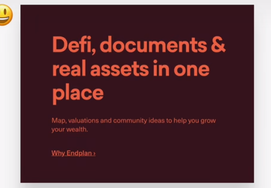
text should usually not be completely black. lighten it up it looks heavy and uninviting
dont make text too light! use a tool to check contrast between text and background colors (tool: coolors)
- contrast ratio needs to be at least 4.5:1 for normal text and 3 : 1 for large text(18px+)
implenting colors
images and illustations
- different types of images: product photos, storytelling photos, illustrations, patterns
- storytelling: using or related to the product
- abstract way of storytelling
- pattens -> background
- use images to support your websites message and story. so only use relevant images!
- perfer original images. if not possible, use orginal-looking stock images(not generic ones!)
- try to show real people to trigger users emtions
- if necessary, corp images to fit your message
- experiment combining photos, illustration and pattern
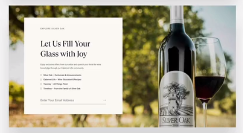
handling text on images
- method #1 darker or brighten image(completely or partially, using a gradient)
- method #2 postion text into neutral image area
- method #3 put text in a box
some technical details
- to account for high-res screens, make image dimensions 2X as big as their displayed size
- compress imgaes for a lower file size and better perfomance
- when using multiple images side by side, make sure they have the exack same dimensions
rule #4: ICONS
- use a good icon pack, there are tons of free and paid icons packs
- use only one icon pack. dont mix icons from different icon packs
- use svg icons or icon fonts. dont use bitmap image formats(.jpg and .png)!
- adjust to website personality! roundness, weight and filled/outlined depend on typography
when to use icons
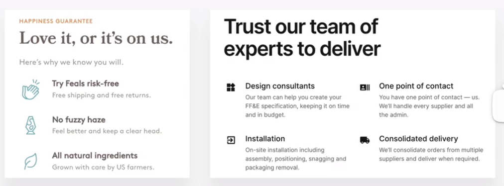
- use icons to provide visual assitance to text
- use icons for product feautre blocks
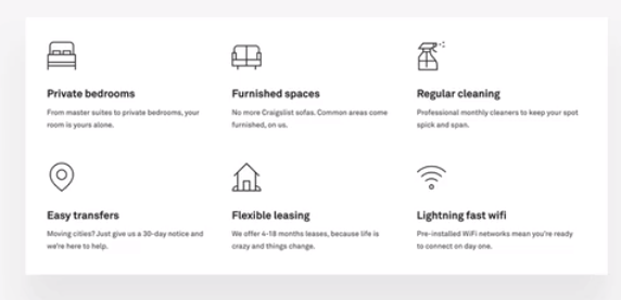
- use icons associated with actions, and label them(unless no space or icon is 100% clear)
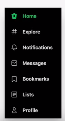
- use icons as bullet points (list)
use icons well
- to keep icons neutral, use same color as text. to draw more attention, use different color
- dont confuse your users: icons need to make sense and fit the text or action!
- dont make icons larger than what they were designed for. if needed, enclose them in a shape
- icons were designed for big use:lots of details, thine lines

implementing icons
rules #5: shadows
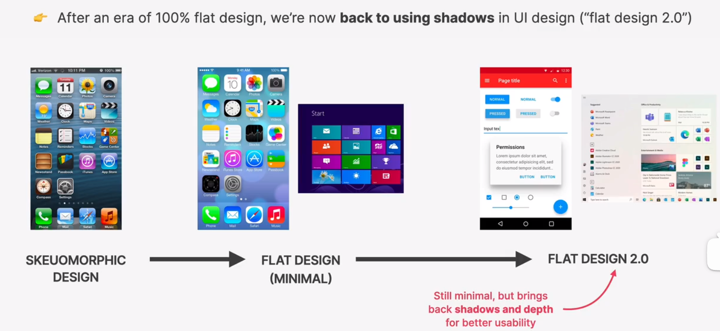
shadow creates depth(3d): ther more shaow, the further away from the interface the element is
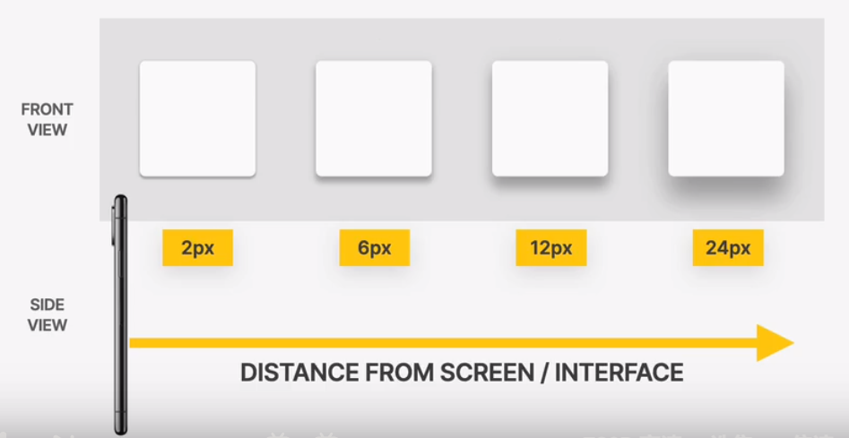
use shadows well
- you dont have to use shadows! only use them if it makes sense for the website personality
- serious/elegant -> less shadows
- playfull/fun -> more shadows
- use shadows in small doses: dont add shadows to every element!
- go light on shadows, dont make them too dark!
use shadows in the right situation
- use small shadows for smaller elements that should stand out (to draw attention)

- use medium-sized shadows for larger areas that should stand out a bit more
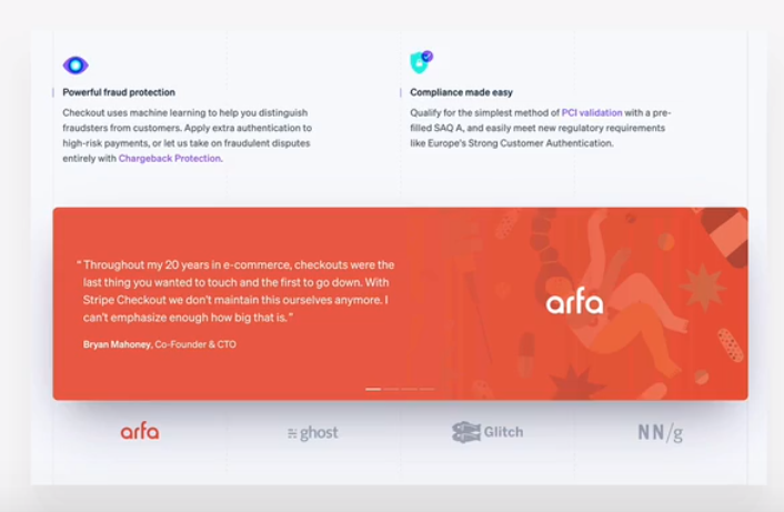
- use large shadows for elements that should really float above the interface
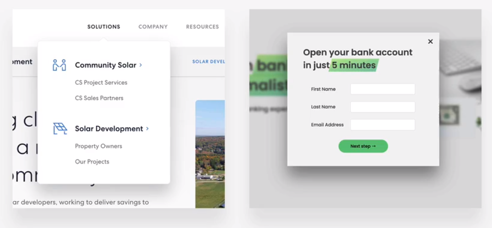
- experiment with changing shadows on mouse interaction (click and hover)

- bonus: experiment with glows(colored shadows)
implementing shadows
rules #6: border-radius
- use border-radius to increase the playfulness and fun of the design, to make it less serious
- typefaces have a certain roundness: make sure that border-radius matches that roundness!
- use border-radius on buttons, image, around icons, standout sections and other elements
implementing border-radius
rules #7: whitespace
the right amount of whitespace make designs look clean, mordern and polished
whitespace communicates how different pieces of information are related to one another
whitespace implies invisible relationships between the elements of a layout
where to use whitespace
- use tons of whitespace between sections
- use a lot of whitespace between groups of elements
- use whitespace between elements
- inside groups of elements, try to use whitespace instead of lines
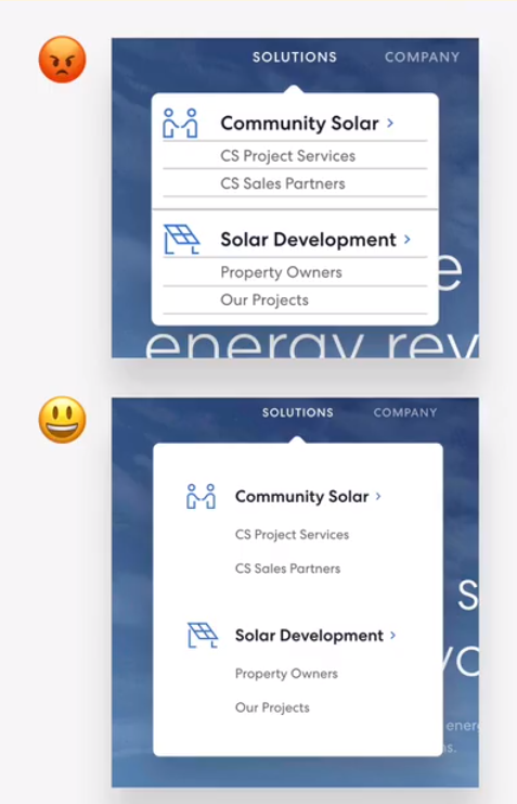
how much whitespace
- the more some elements(or groups of elements) belong together, the closer they should be!
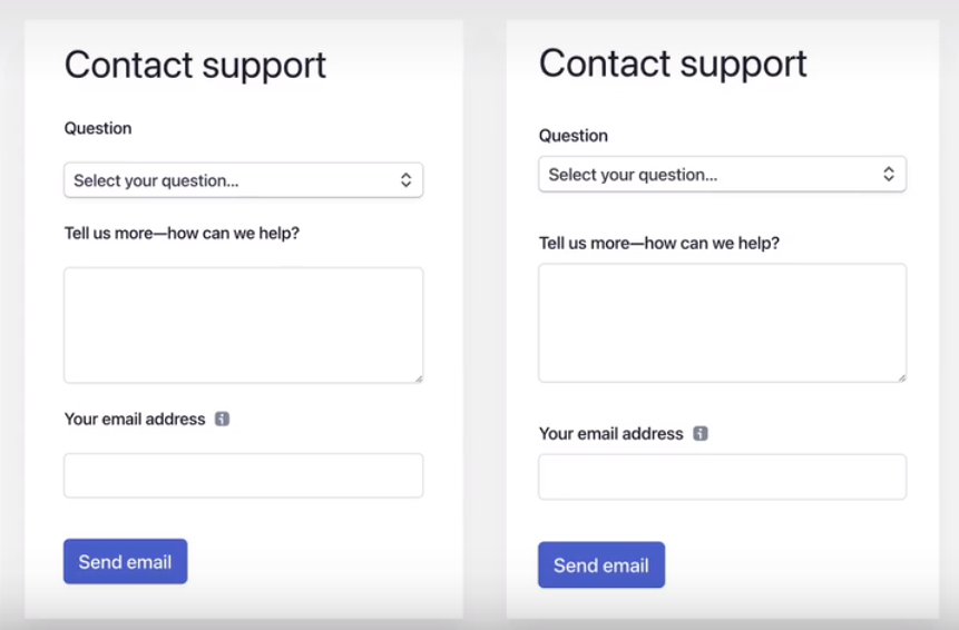
- start with a lot of whitespace, maybe even too much! then remove whitespace from there
- to much whitespace looks detached, too little looks too crammed
- match other design choices.
- if you have big text or big icons, you need more whitespace.
- try a hard rule, such as using multiplesof 16px for all spacing

rule #8: visual hierarchy
establishing which elements of a design are the most important ones
visual hierarchy is about drawing attention to these most important elements
visual hierarchy is about defining a “path” for users, to guide them through the page
we use a combination of position, size, colors, spacing, borders, and shadows to establish a meaningful visual hierarchy between elements/components
fundamentals
- position important elements closer to the top the page, where they get more attention
- use images mindfully, as they draw a lot of attention(larger images get more attention)
- whitespace create separation, so use whitespace strategically to emphasize elements
hierarchy for text elements
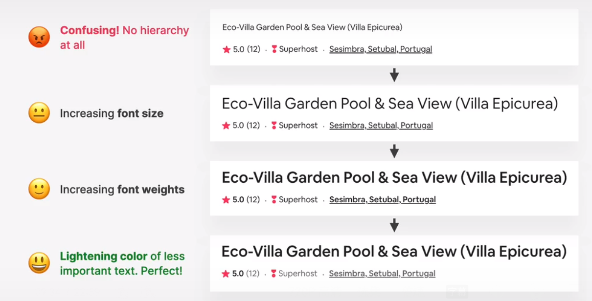
- for text elements, use font size, font weight, color, and whitespace to convey importance.
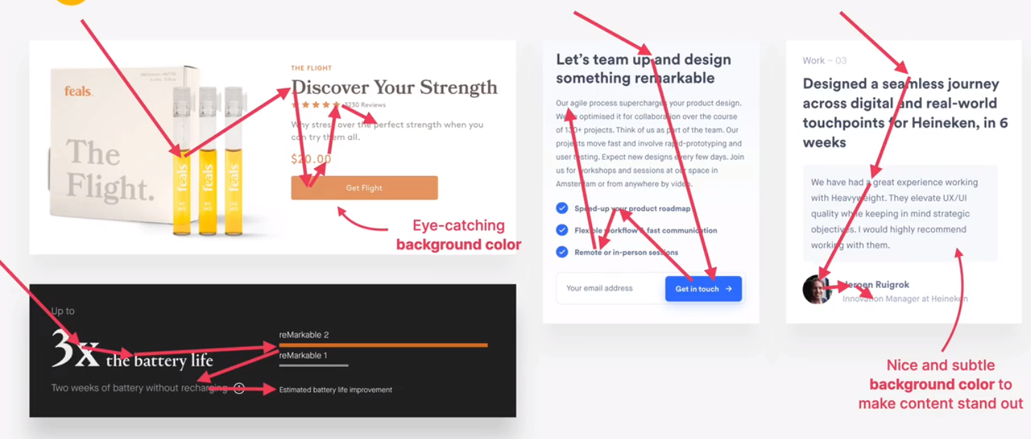
- what text elements to emphasize? titles, subtitles, links, buttons, data points, icons
- you can de-emphasize less important text, like labels or secondary/additional information

hierarchy between components
- emphasize an important component using background color, shadows, or border(or multiple)
- try emphasizing some component a over component b by de-emphasizing component b
- what components to emphasize?
- testimonials, call-to-action sections, highlight sections, preview cards, form, pricing tables, important rows/columns in table, etc.
 testimonials, call-to-action sections, highlight sections
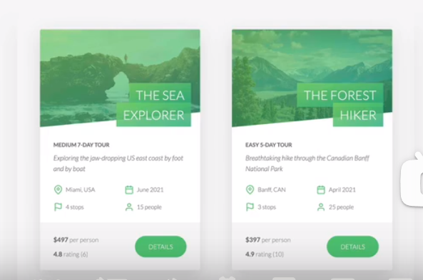 preview cards
 form, pricing tables, important rows/columns
implementing whitespace and visual hierarchy
rules #9: user experience(ux)
what is ux
“design is not just what it looks like and feels like. design is how it works” –Steve Jobs
user experience is the overall experience the user has while interacting with the product
- does the app feel logical and well thought out
- does the navigation work intuitively
- are users reaching their goals
ux design guiding principle: goals
- a website or application exists for a reason: a user has a goal for visiting it, and a business has a goal for creating it.
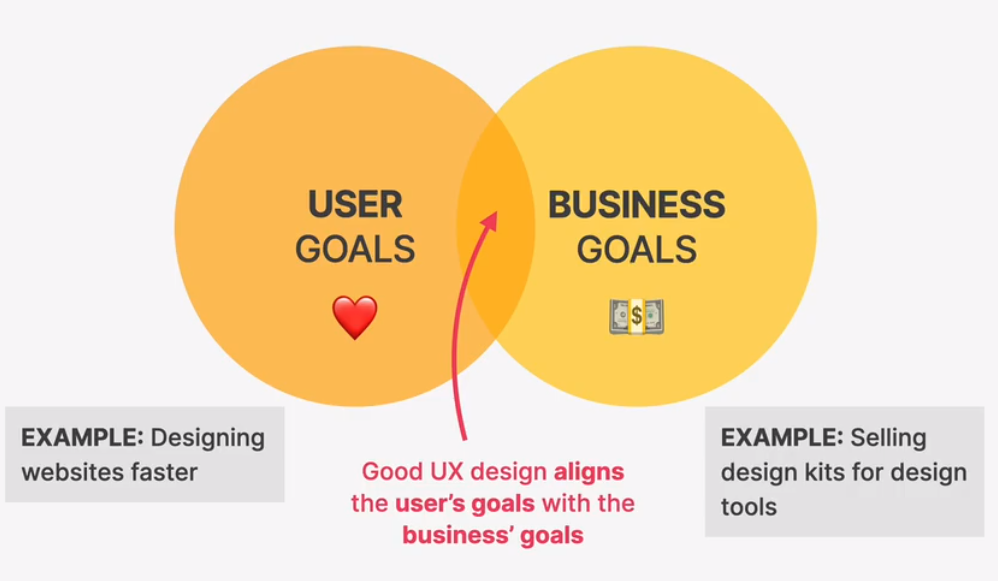
ux rules for usability
- dont design complicated layouts. dont reinvent the wheel. use patterns that users know.
- make your call-to-action the most prominent element, and make the text descriptive.
- use blue text and underlined text only for links
- animations should have a purpose and be fast: between 200 and 500 ms
- in forms, align labels and fields in a single vertical line, to make the form easier to scan
- offer users good feedback for all actions: form errors, form success, etc.
- place action buttons where they will create an effect(law of locality)
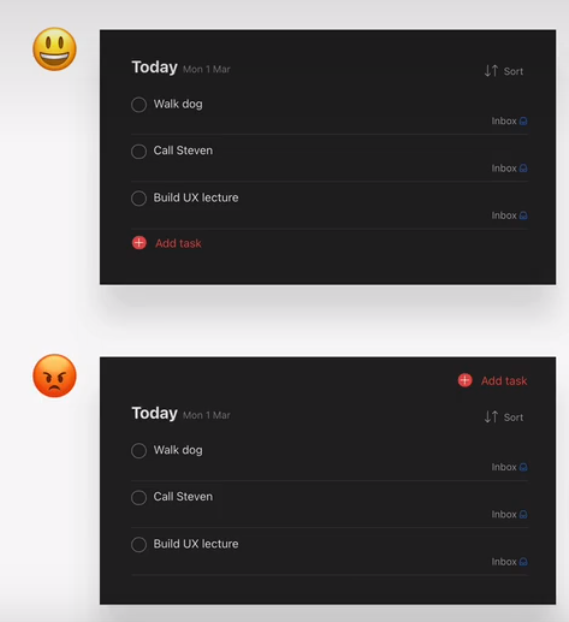
ux rules for website content
- use a descriptive, keyword-focused headline on your main page. dont be vague or fancy!
- only include relevant information, efficiently! cut out fluff and make the content 100% clear
- use simple words! avoid technical jargon and “smart-sounding” words
- break up long text with sub-heading, images, block quotes, bullet points, etc.
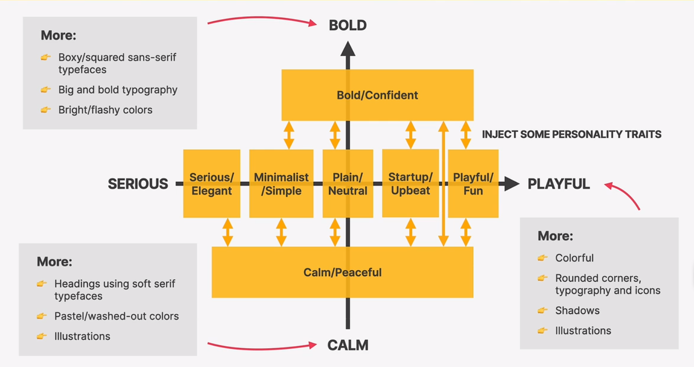
the website-personalities-framework

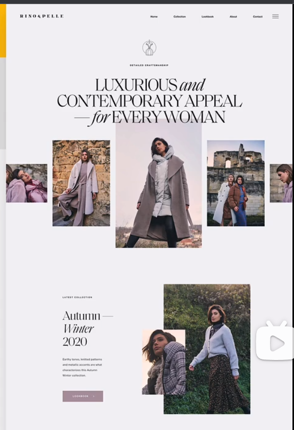
- serious/elegant
industries: real estate, high fashion, jewelry, luxury products or services
typography: serif typefaces(especially in headings), light font weight, small body font size
colors: gold, pastel colors, black, dark blue or grey
image: big, high-quality images are used to feature elegant and expensive products
icons: usually no icons, but thin icons and lines may be used
shadows: usually no shadows
boarder-radius: usally no border-radius
layout: a creative and experimental layout is quite common
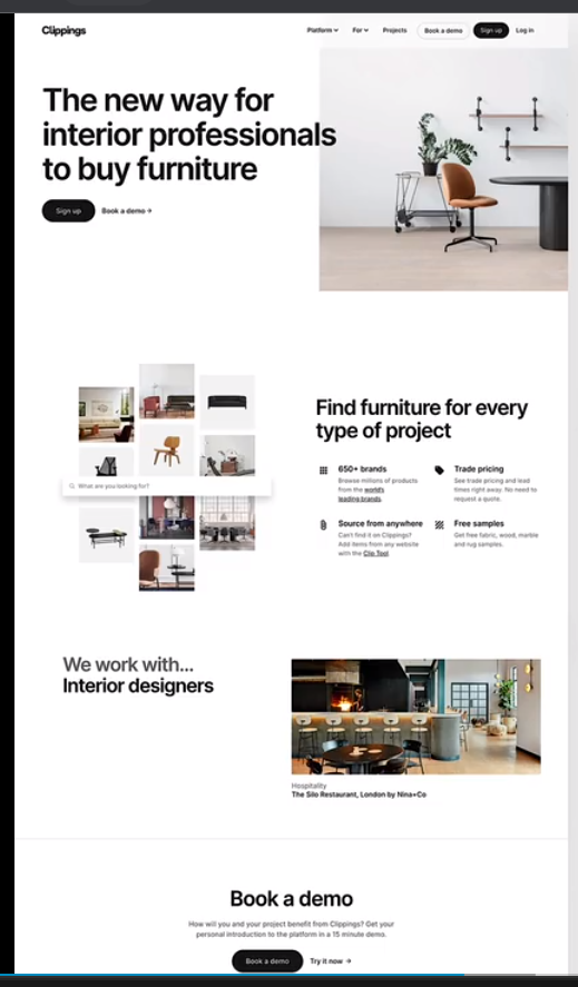
- minimalist/simple
industries: fashion, porfolios, minimalism companies, software startups
typography: boxy/squered sans-serif typefaces, small body font size
colors: usually black or dark grey, on pure white background. usually just one color throughout the design
images: few images, which can be uesed to add some color to the design. usually no illustrations, but if, then just black
icons: usally no icons, but small simple black icons may be used
shadow: usually no shadows
border-radius: usually no border-redius
layout: simple layout, a narrow one-column layout is quite common.
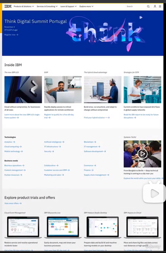
- plain/neutral
industries: well-established corporations, companies that dont want to make an impact through design
typography: neutral-looking sans-serif typefaces are used, and text is usually small and doesnt have visual impact
colors: safe colors are employed, nothing too bright or to washed-out. bule and blacks are common
images: images are frequently used, but usually in a small format
icons: usally no icons, but simple icons may be used
shadows: usually no shadows
border-radius: usually no border-radius
layout: structured and condensed layout, with lots of boxes and rows
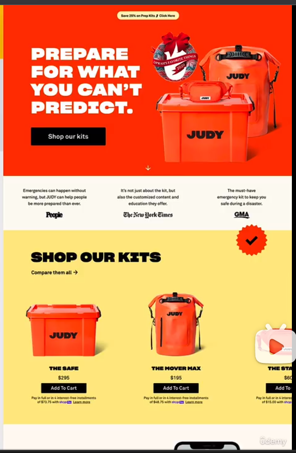
- bold/confident
industries: digital agencies, software starups, travel, “strong” companies
typography: boxy/squared sans-serif typefaces, big and bold typography, especially headings. uppercase headings are common
color: usually multiple bright colors. big color blocks/sections are used to draw attention
images: lots of big images are usually displayed
icons, shadows, border-radius: usually no
layout: all kinds of layouts, no particular tendencies
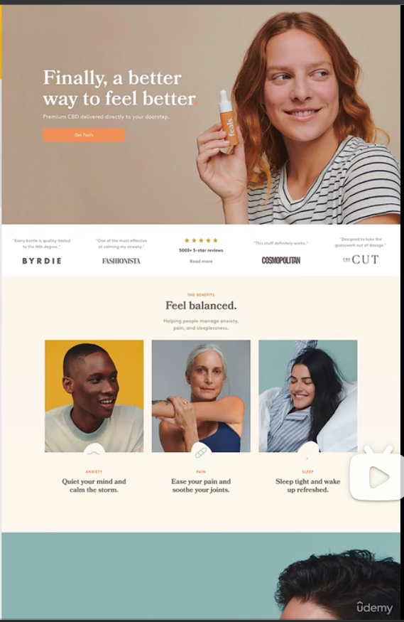
- calm/peaceful
industries: healthcare, all products with focus on consummer well-being
typography: soft serif typefaces frequently used for headings, but sans-serif heading might be used too
colors: pastel/washed-out colors: light oranges, yellows, browns, greens, blues
images: images and illustrations are usual, matching calm color palette
icons: icons are quite frequent
shadows: usually no shadows, but might be used sparingly
border-radius: some border-radius is usual
layout: all kinds of layout, no particular tendencies
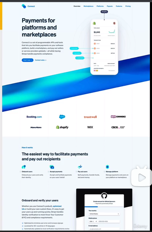
- startup/upbeat
industries: software starups, and other modern-looking companies
typography: medium-sized headings(not too large), usually one sans-serif typeface in whole design. tendency for light text colors
colors: blues, greens and purples are widely used. lots of light background(mainly gray), gradients are also common
image: images or illustrations are always usesd. 3d illustartions are morden. sometimes patterns and shapes add visual details
icons: icons are very frequent
shadows: subtle shadows are frequent. glows are becoming modern
border-radius: border-radius is very common
layout: rows of cards and z-pattens are usual, as well as animations
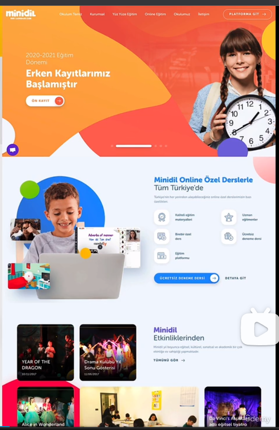
- playful/fun
industries: child products, animal products, food
typography: round and creative(e.g. handwritten) sans-serif typefaces are ferquent. centered text is more common
colors: multiple colors are frequently used to design a colorful layout, all over background and text
images: images, hand-drawn(or 3d)illustrations, and geometric shapes and patterns are all very frequently used
icons: icons are very frequent. many times in a hand-drawing style
shadows: subtle shadows are quite common, but not always used
border-radius: border-radius is very common
layout: all kinds of layouts, no particular tendencies
components and layout patterns
rule #10 - part 1: elements and components
elements -> components ->layouts -> webpage
use common elements and components to convey your websites information
combine components into layout using common layout patterns
assemble different layout areas into a complete, final page
A elements
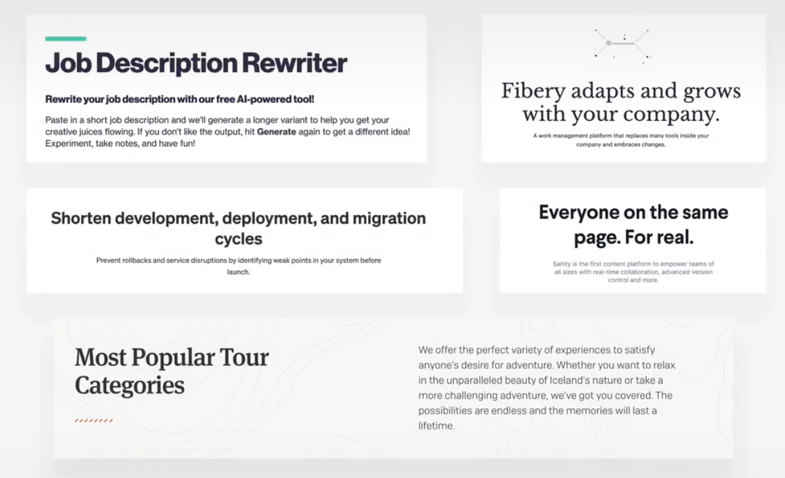
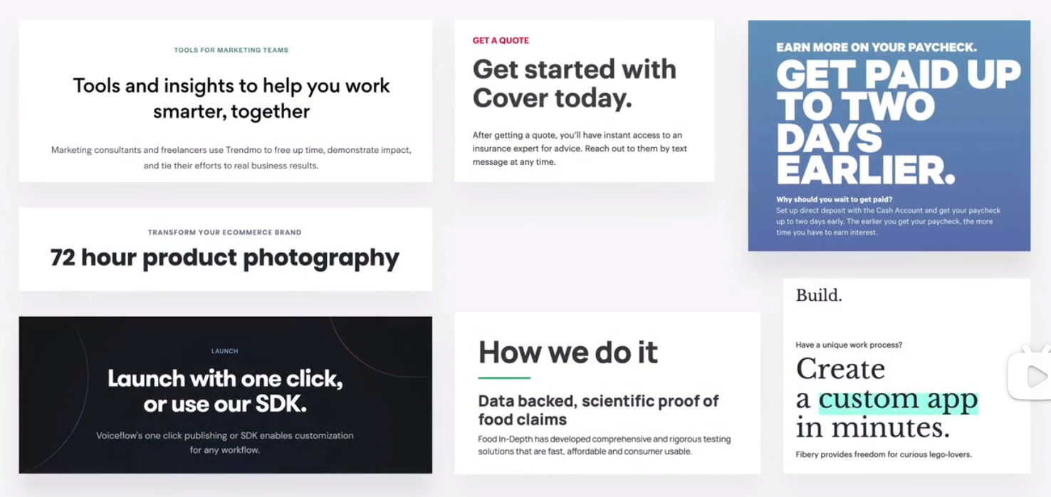
text
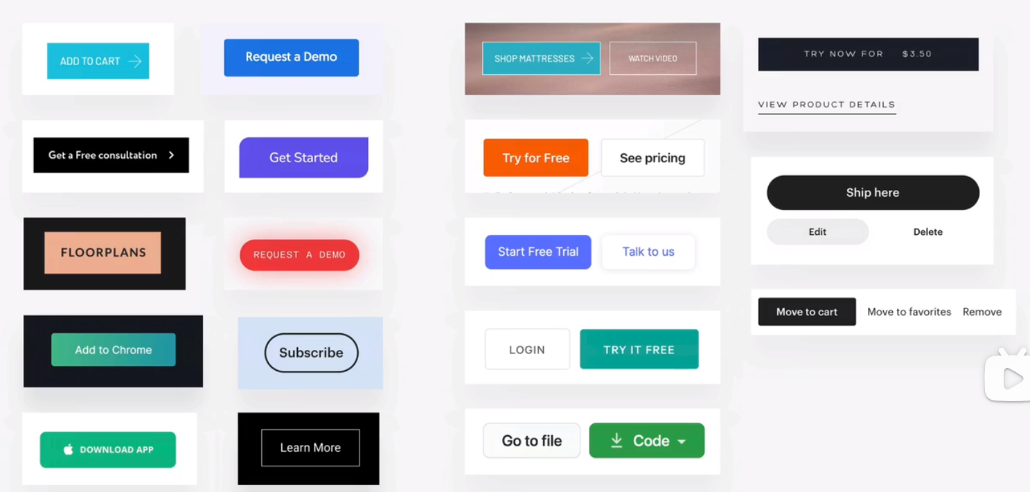
buttons
images
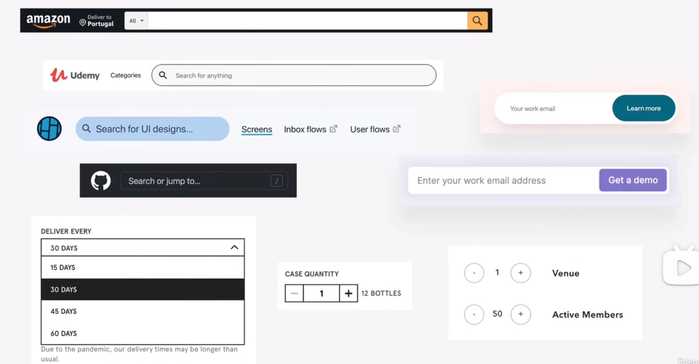
input elements
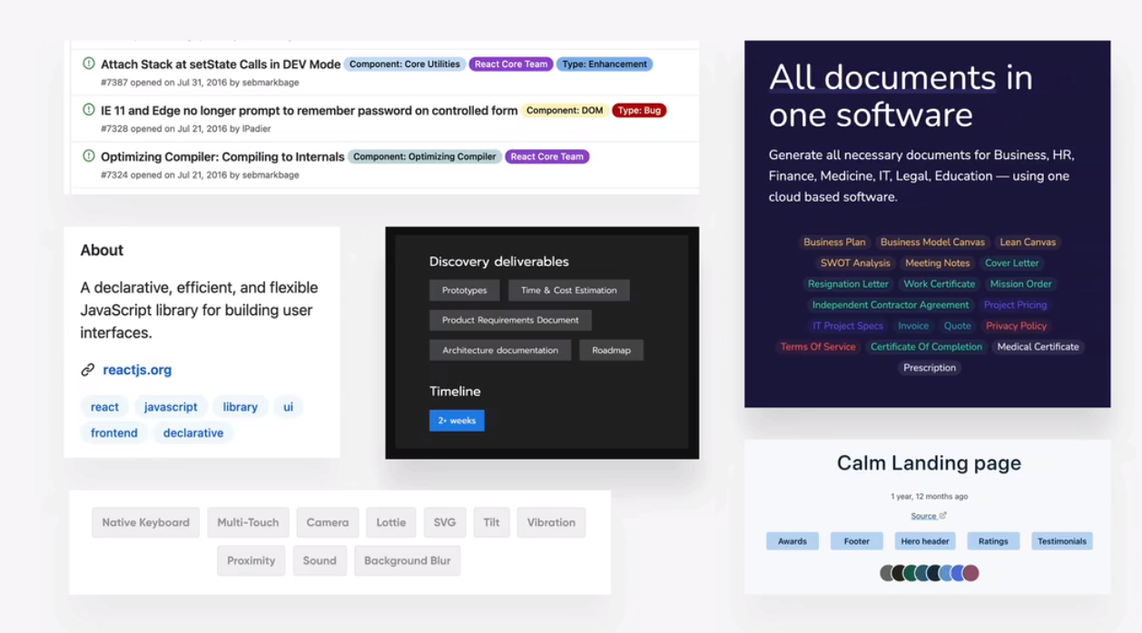
tags
B components
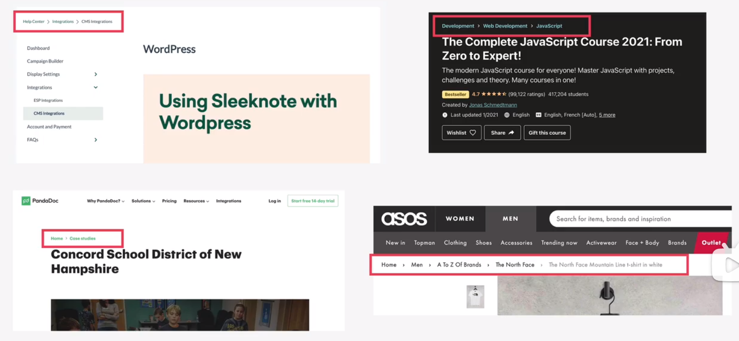
breadcrumbs
pagination
alert and status bars
statistics
gallery
feature box
preview and profile cards
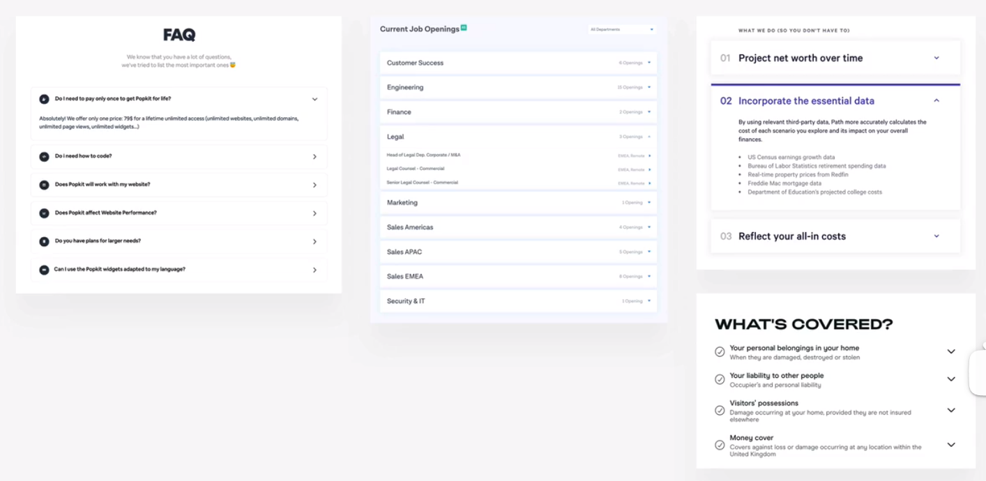
accordion
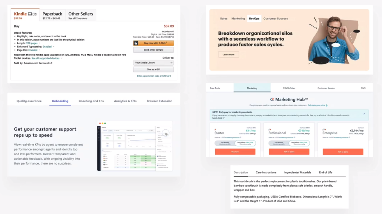
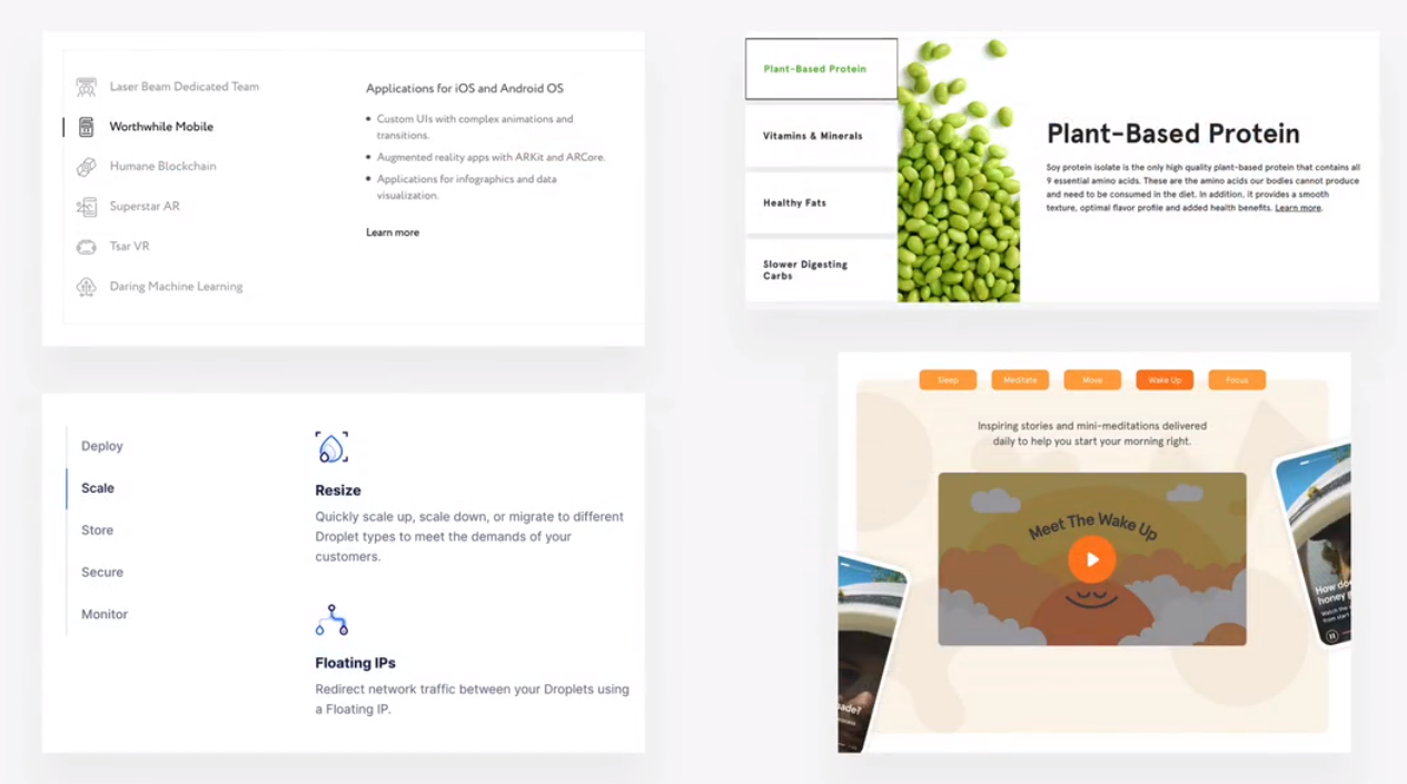
tabs
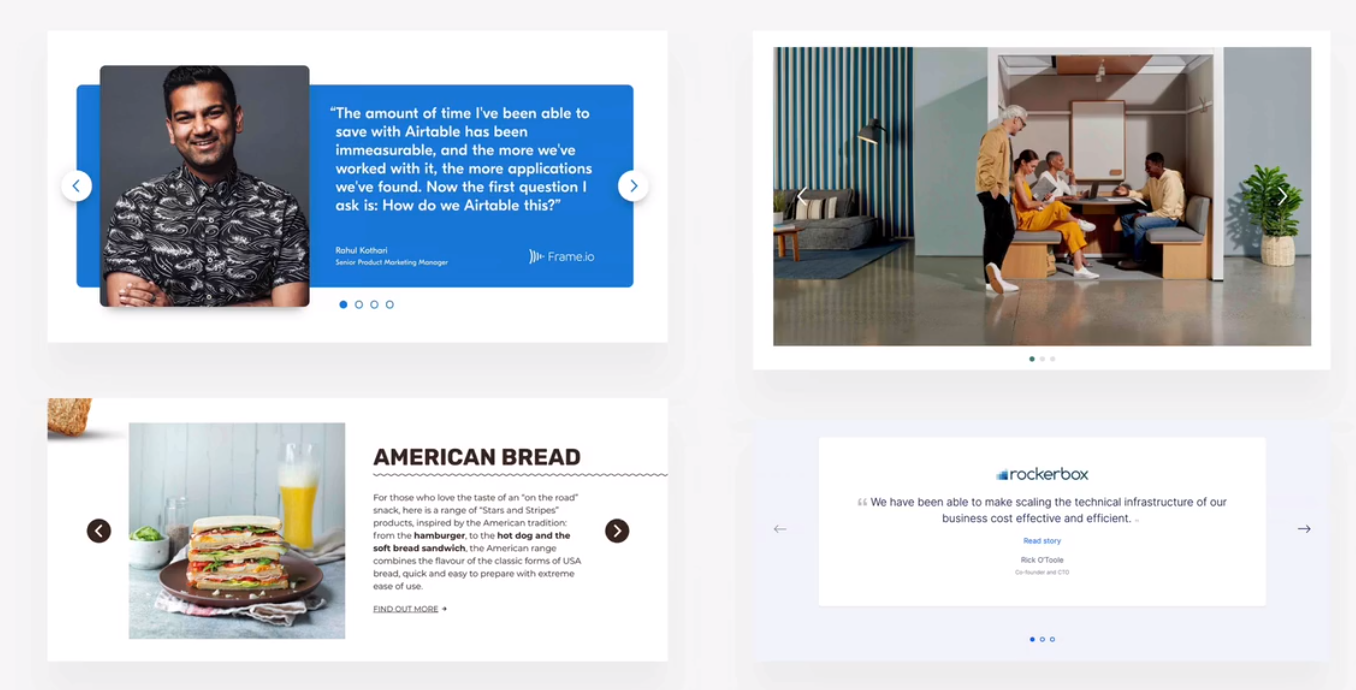
carousel
customer testimonials
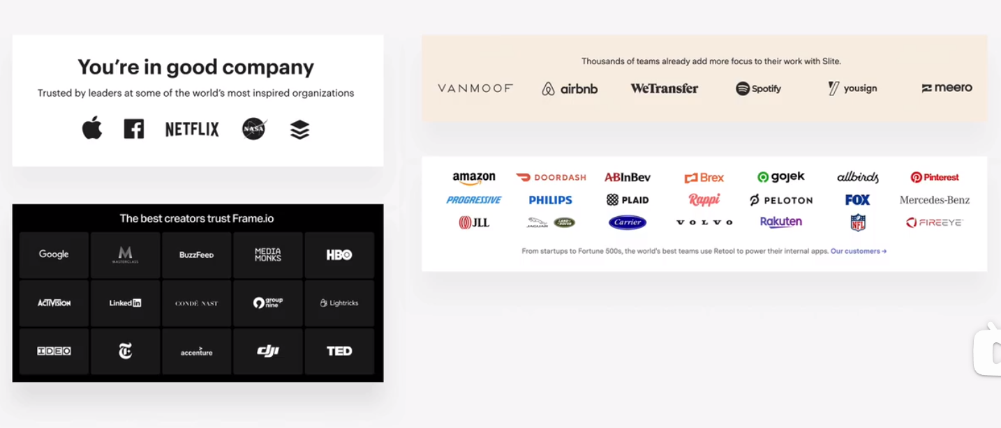
customer logos
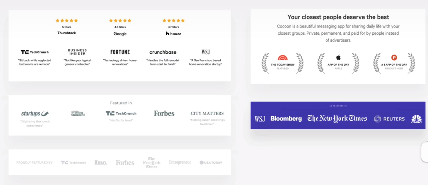
featured-in logos
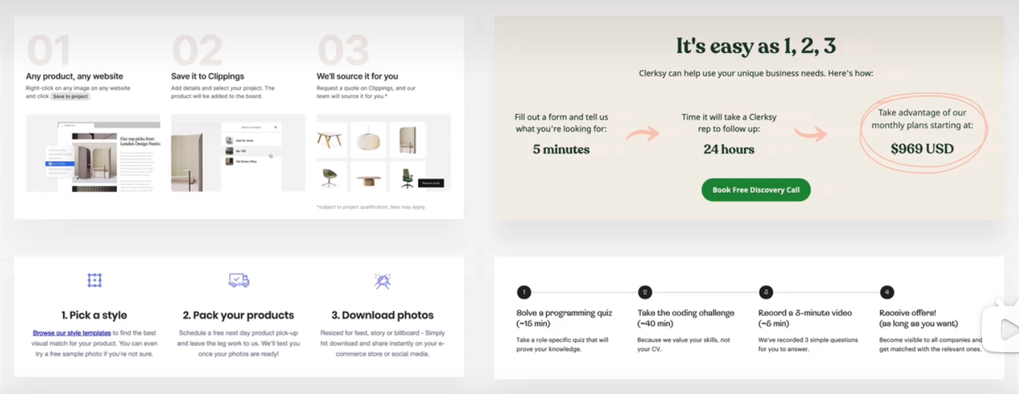
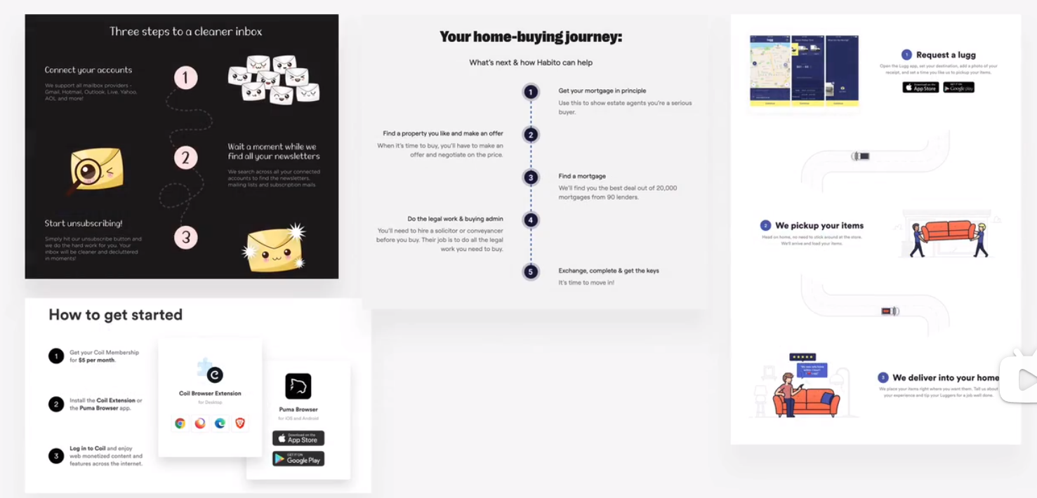
steps
forms
tables
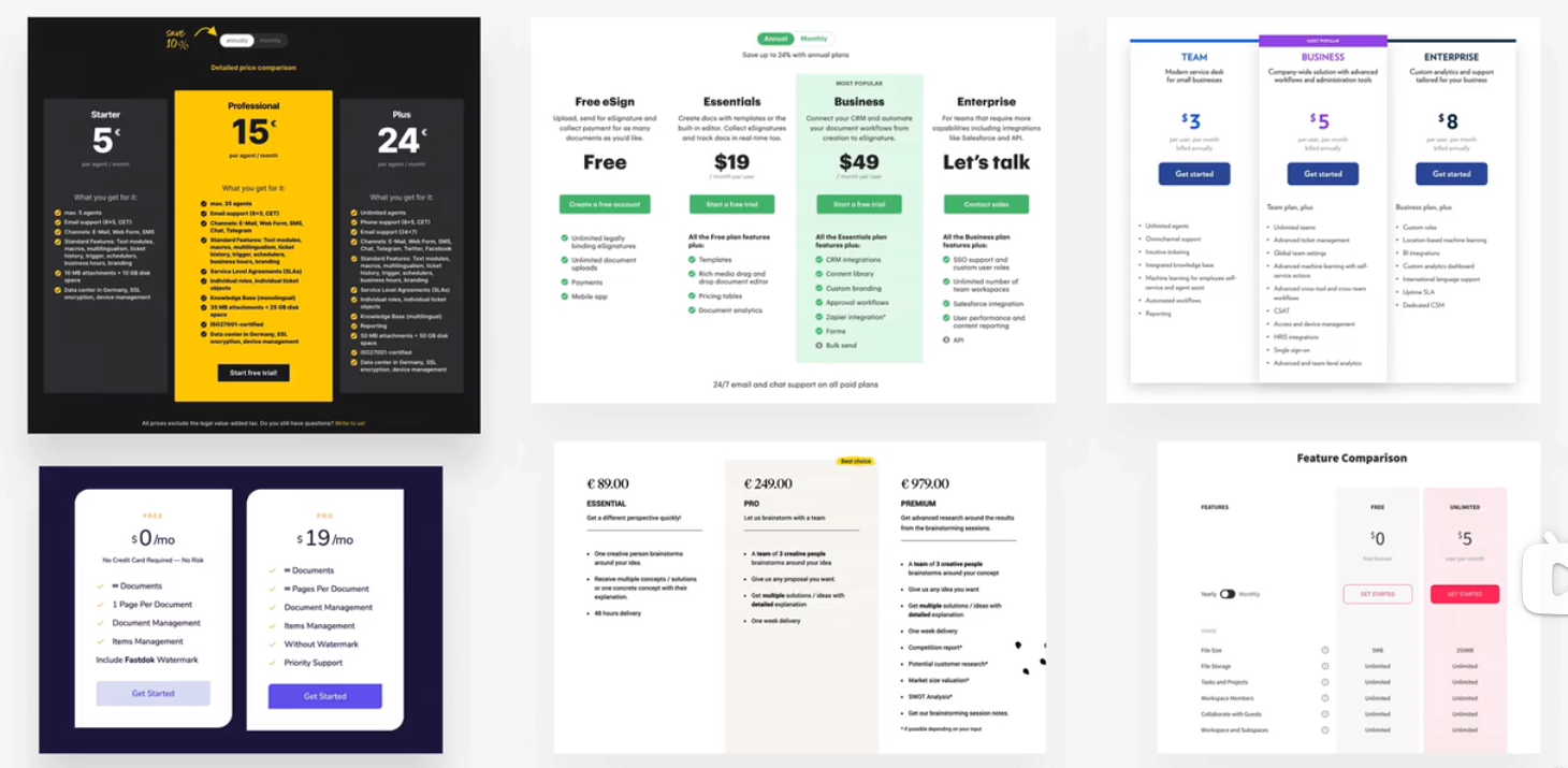
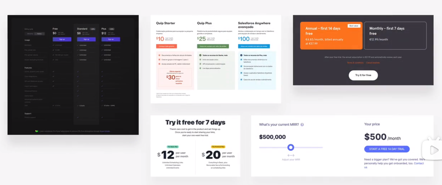
pricing tables
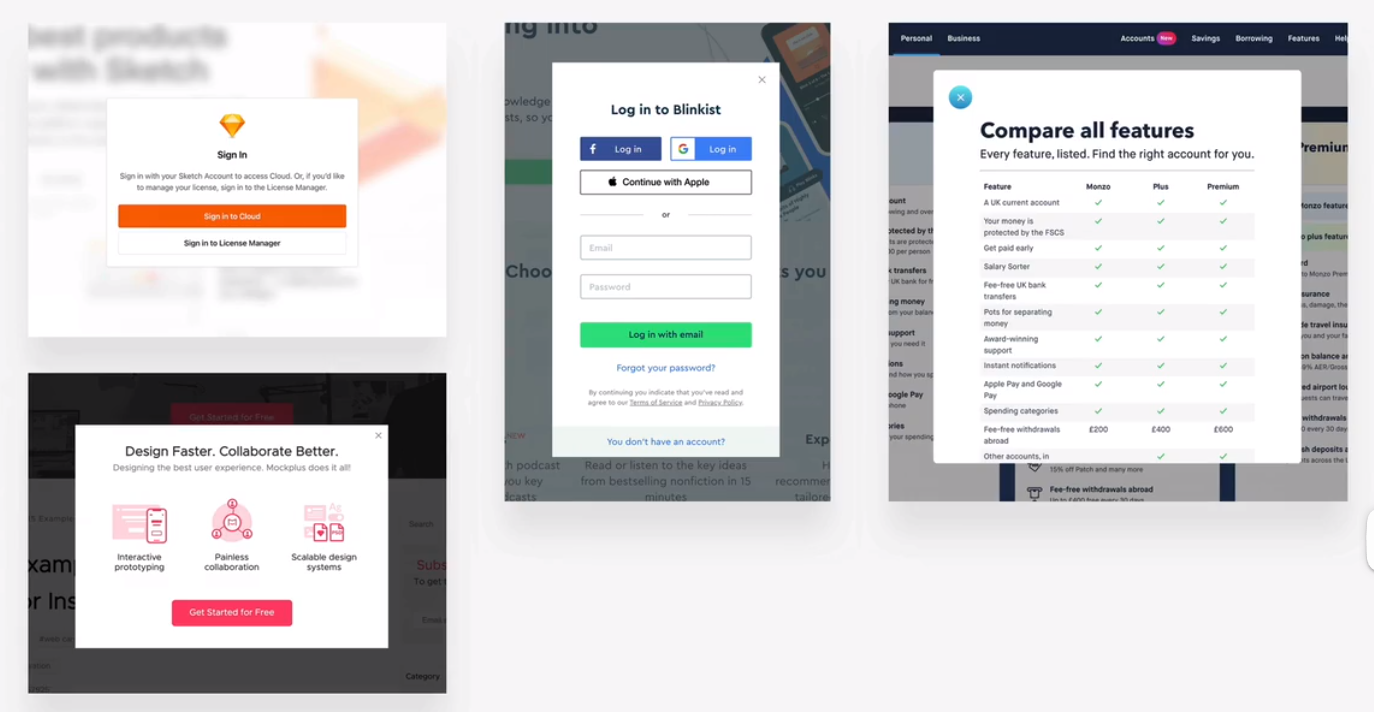
modal widows
C section components
navigaiton
herosection
footer
call to action section
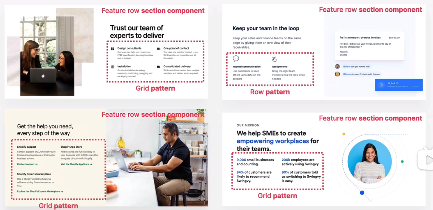
feature row
D layout patterns
row of boxes or cards
grid of boxes or cards
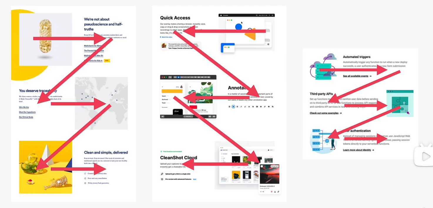
z pattern
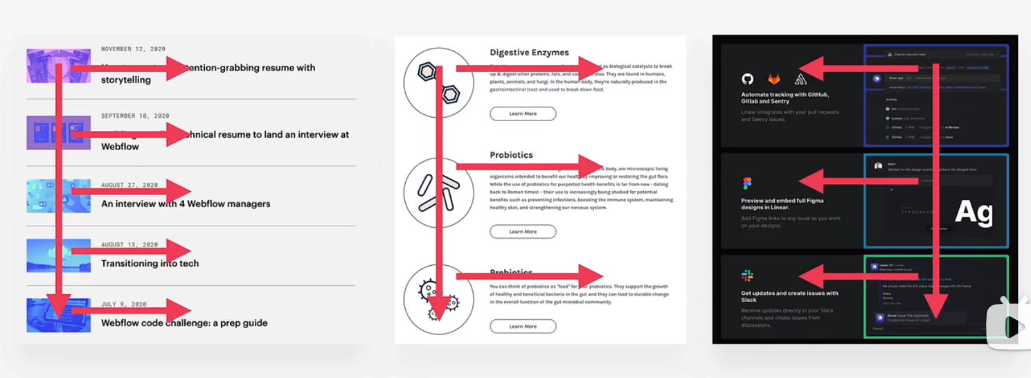
f pattern
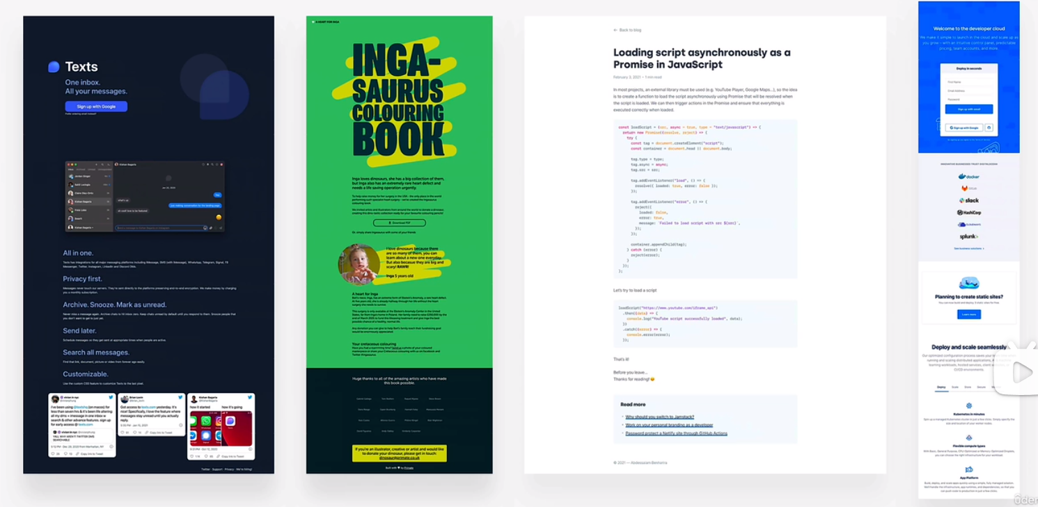
single column
sidebar
multi-column/magzine
asymmetry/experimental
text
button
image
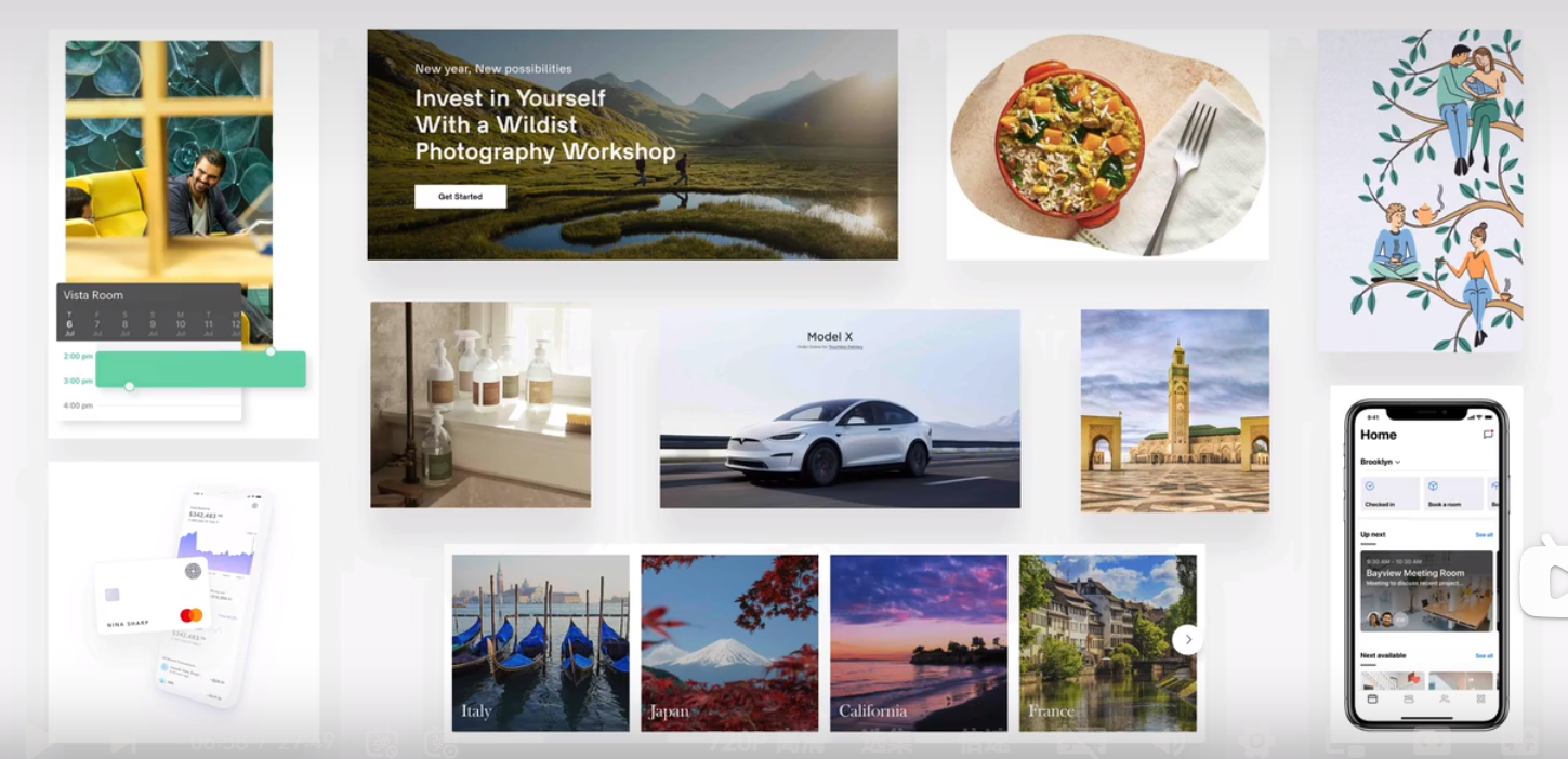
input elements
tag
components
breadcrumbs
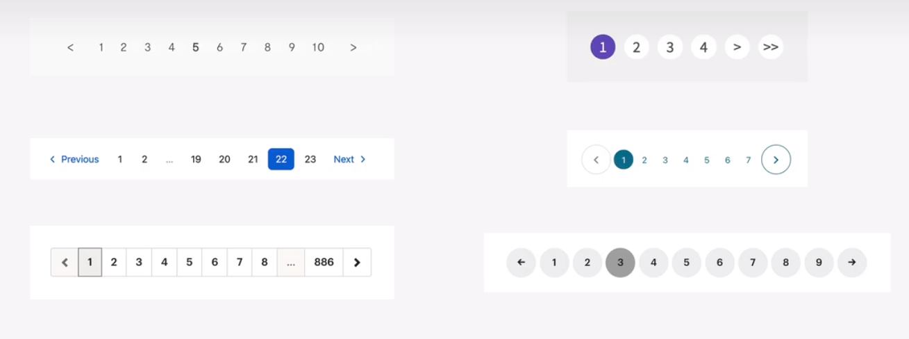
pagination
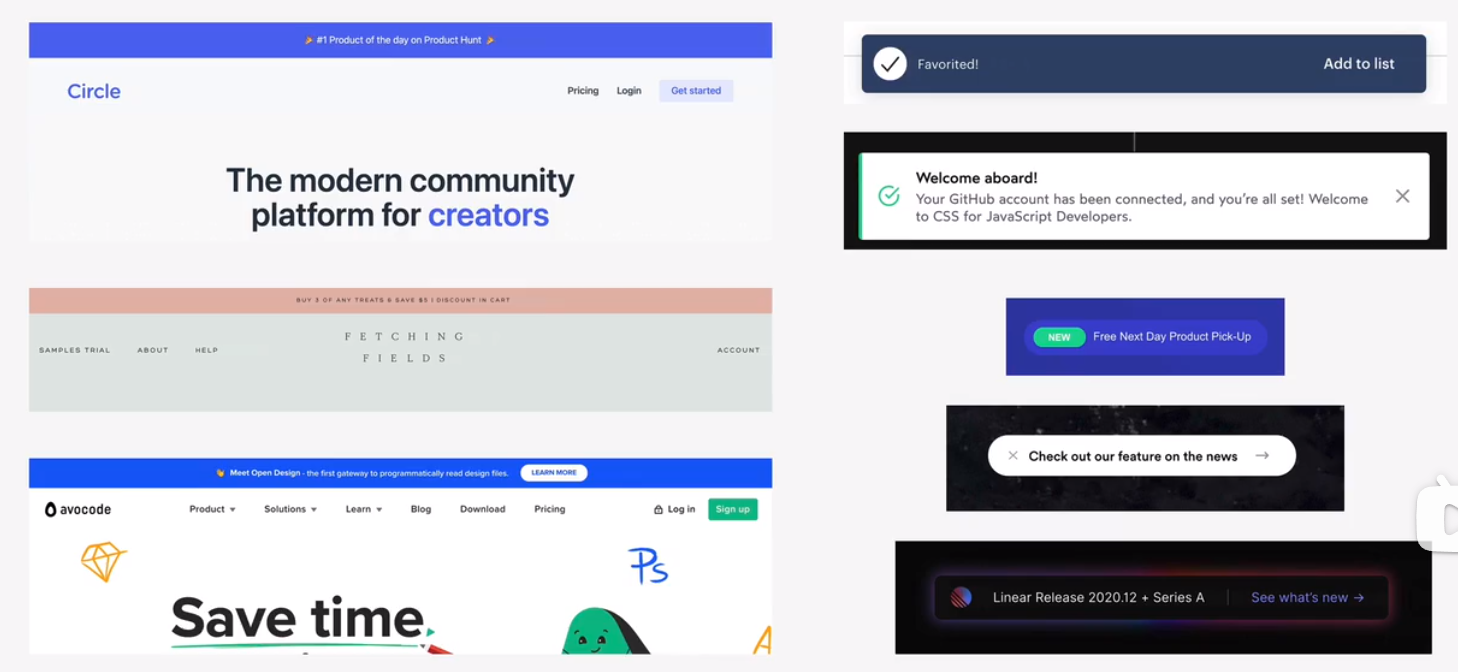
alert and status bars
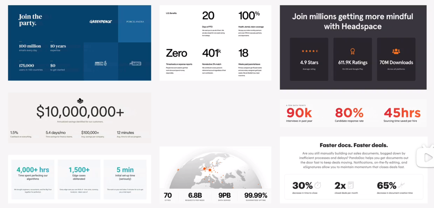
statistics
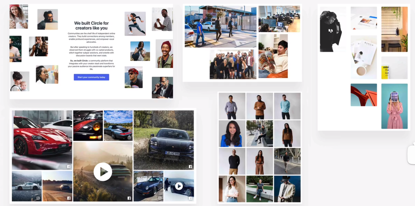
gallery
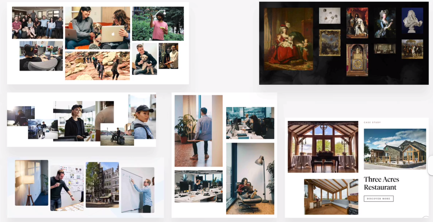
feature box
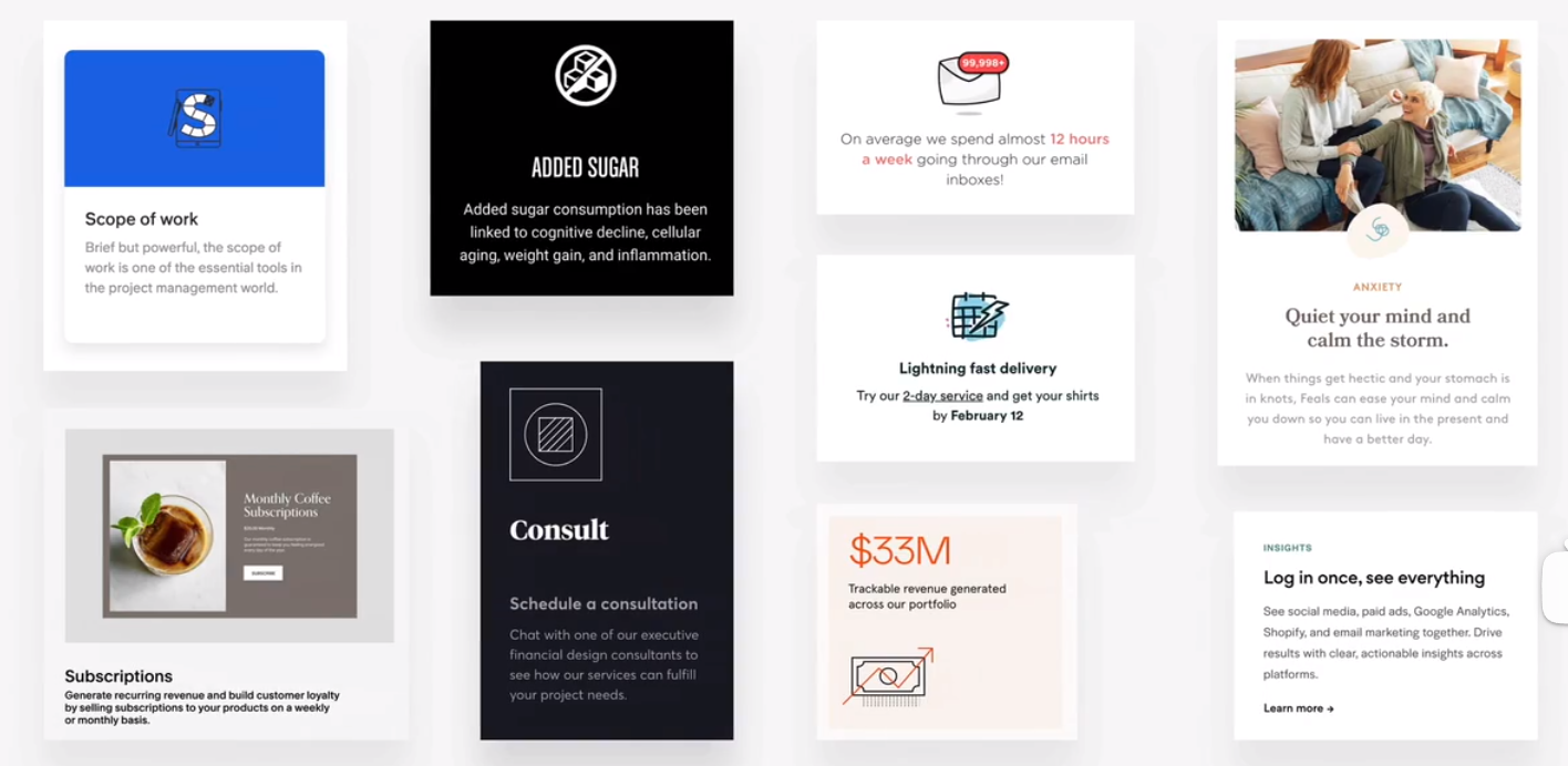
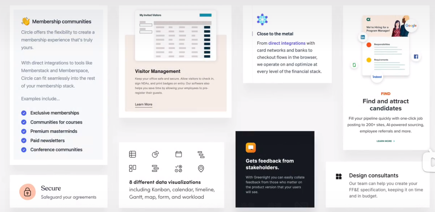
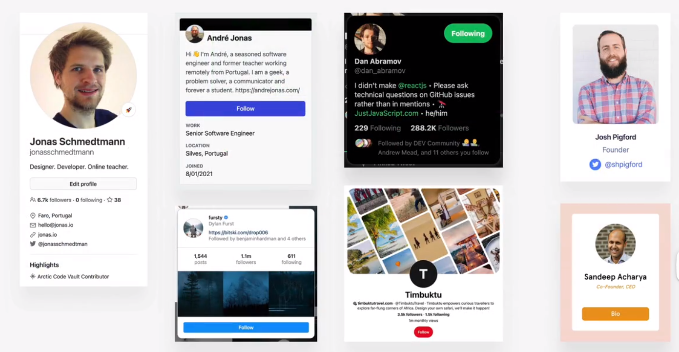
preview and profile cards
have data
click to some action
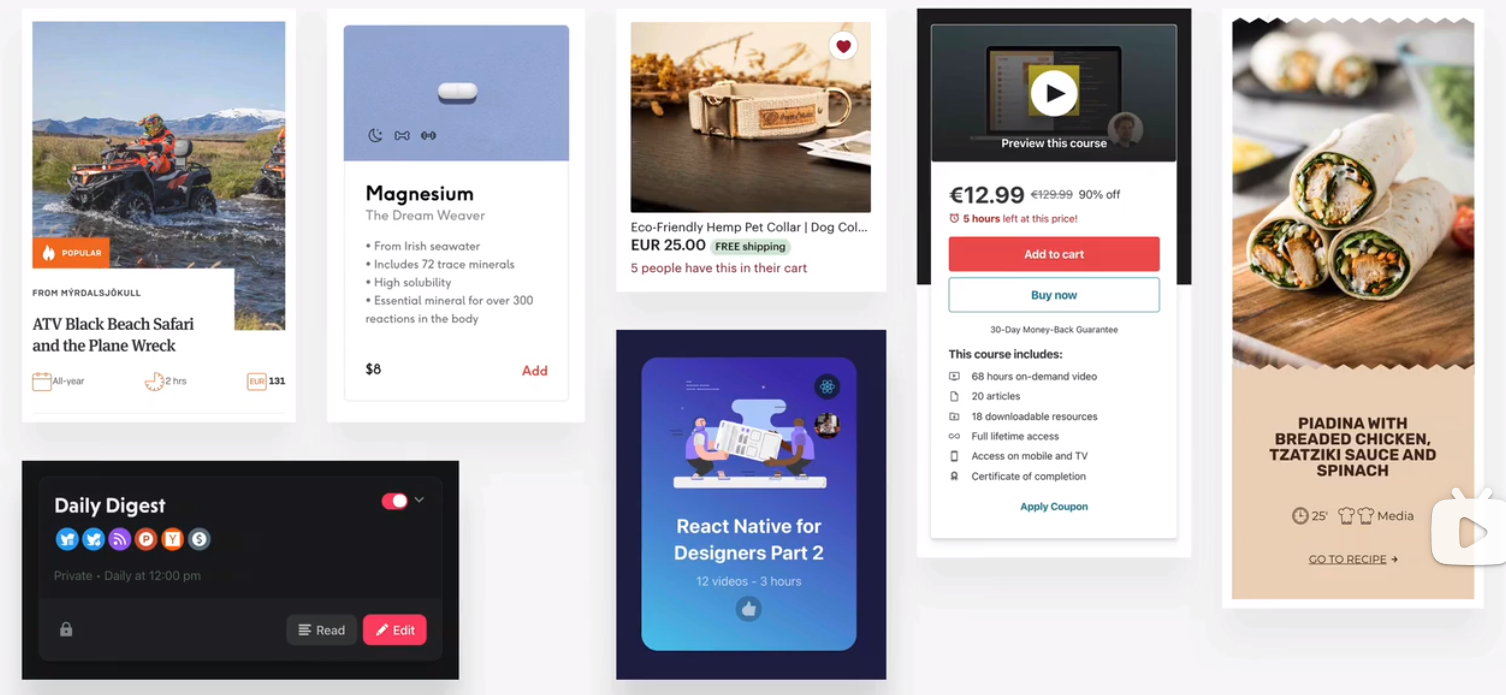
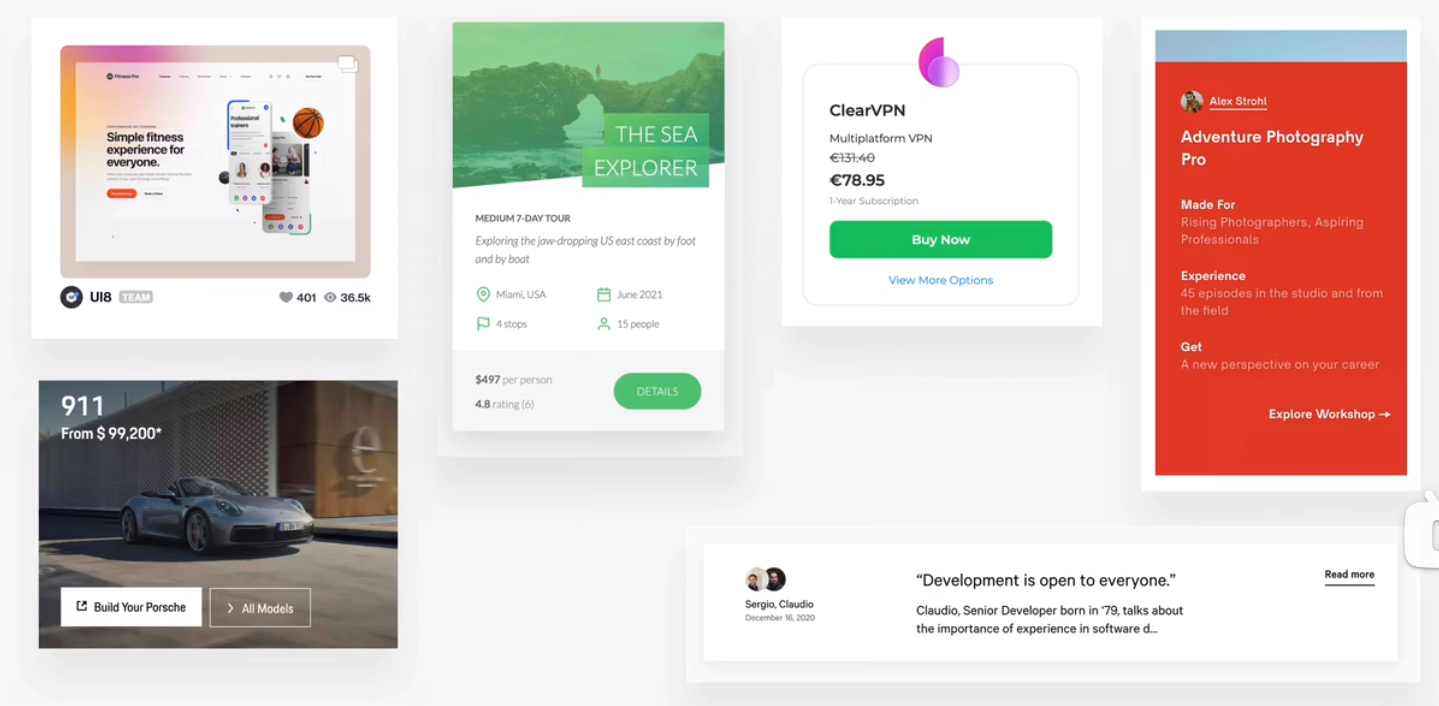
- profile card
accordion
hiding information
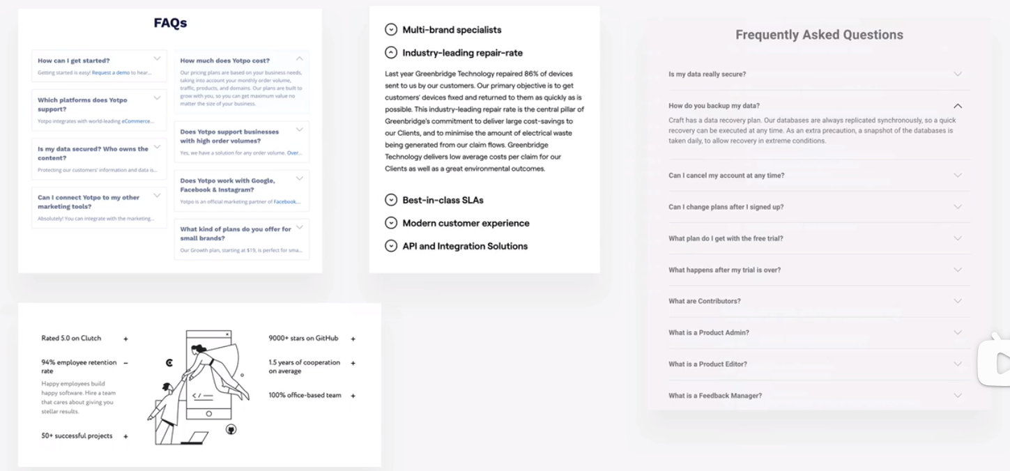
tab
carousel
slider
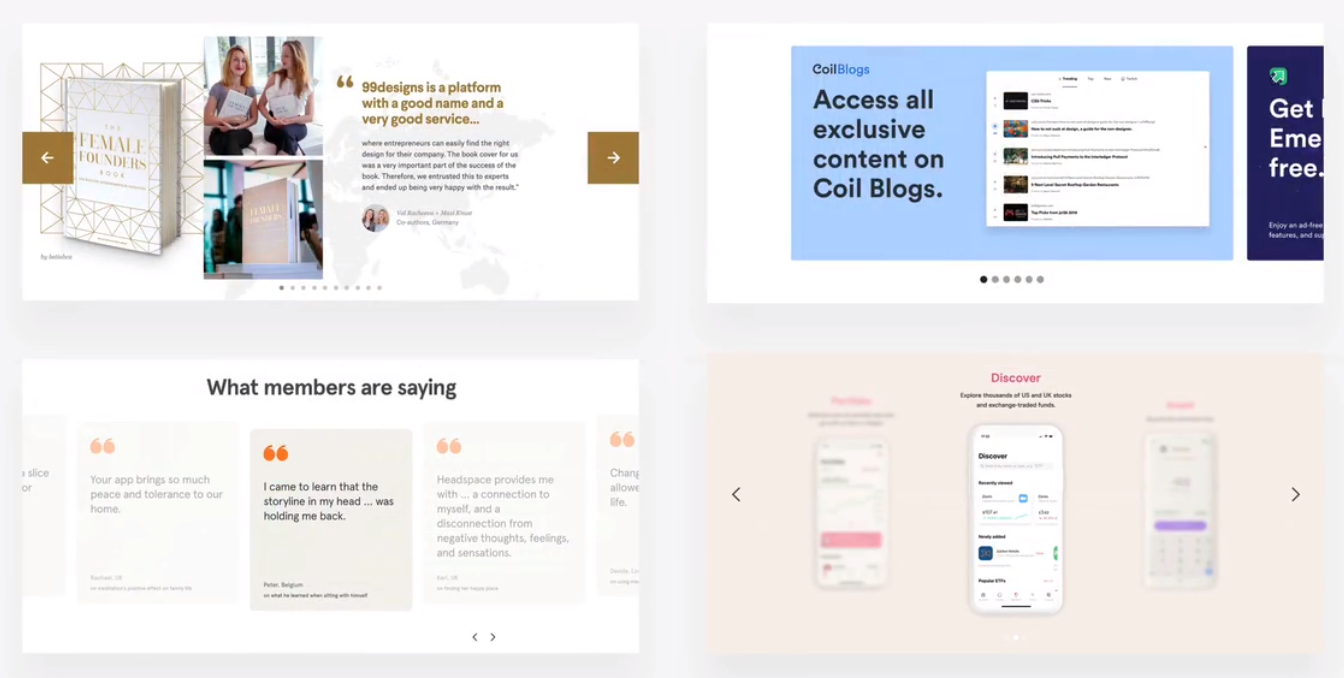
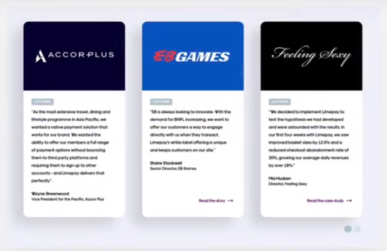
customer testimonials
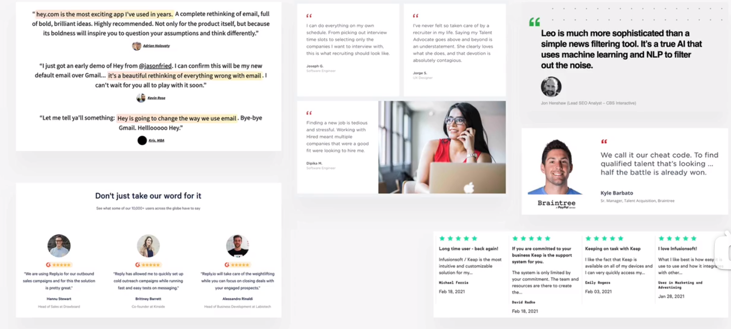
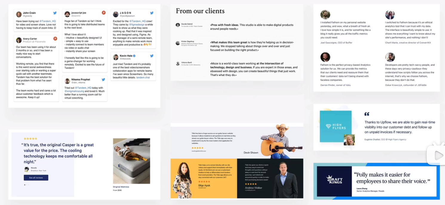
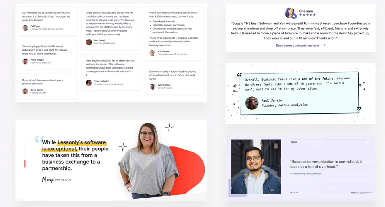
customer logos
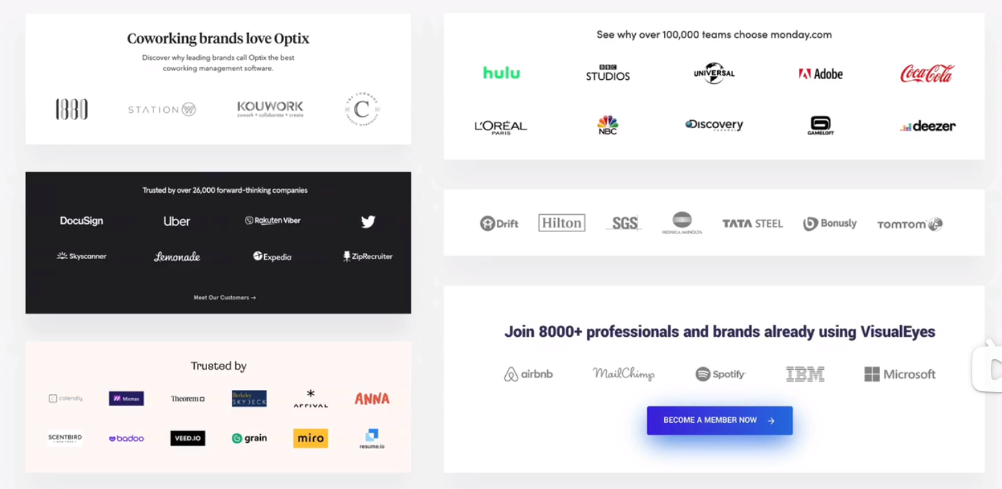
featured-in logo
steps
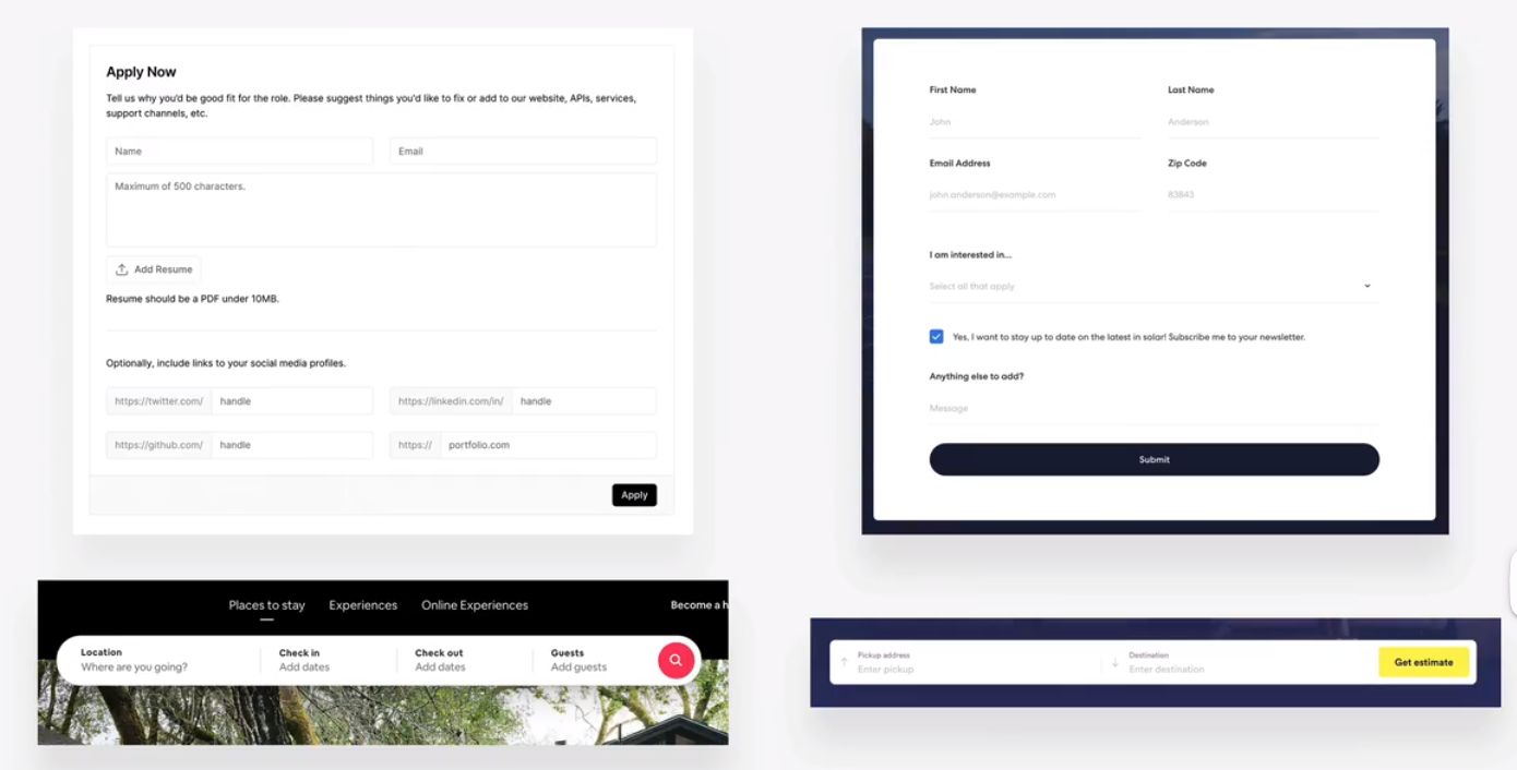
forms
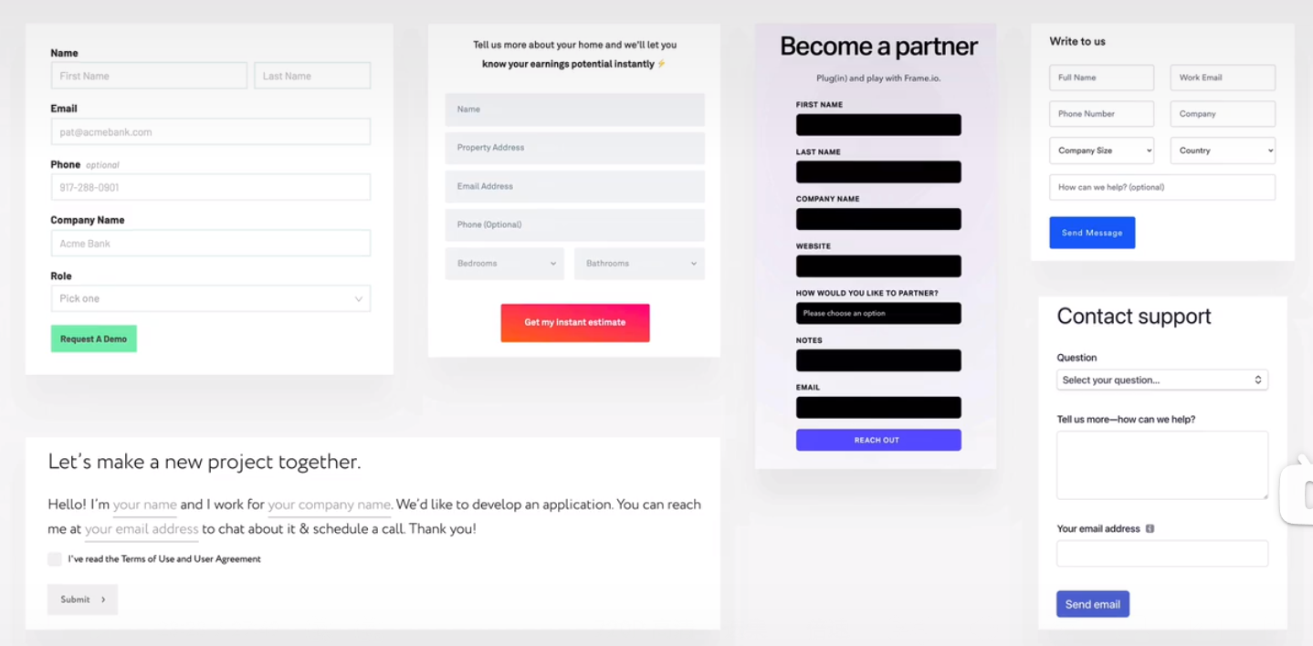
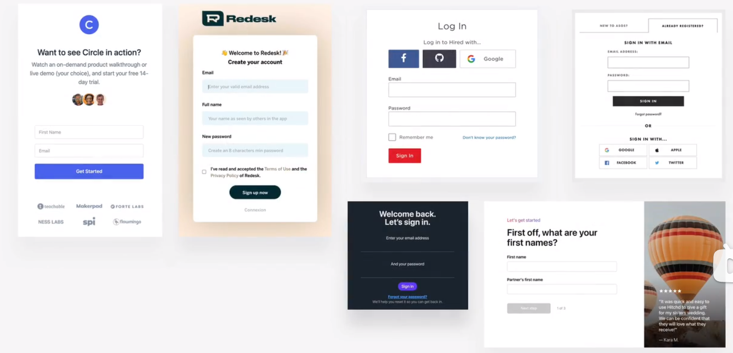
- login
table
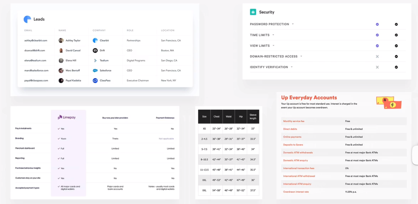
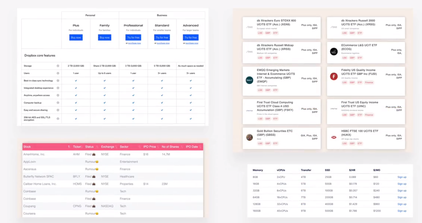
pricing table
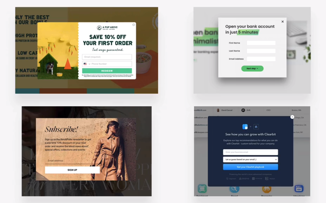
modal windows
弹窗
function
marketing
building an accordion component - part 1
building an accordion component - part 2
building a carousel component - part 1
chrome dev tool
delete elements
building a carousel component - part 2
building a table component - part 1
building a table component - part 2
building a pagination component challenge # 1
rule #10 part 2: layout patterns
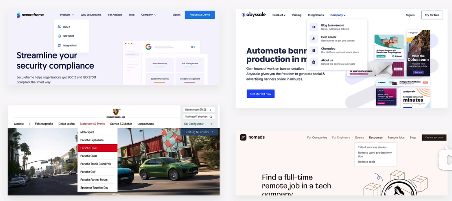
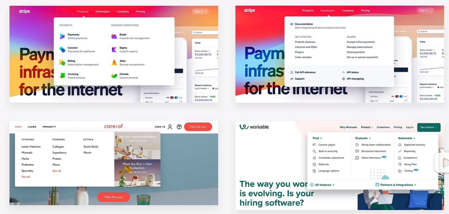
navigation
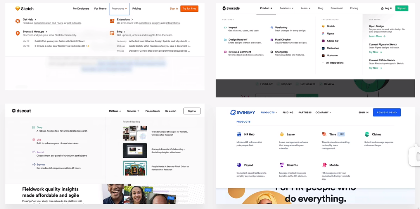
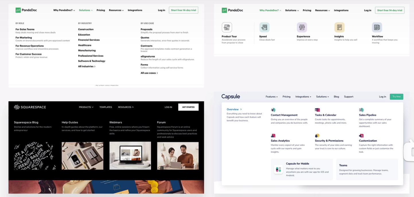
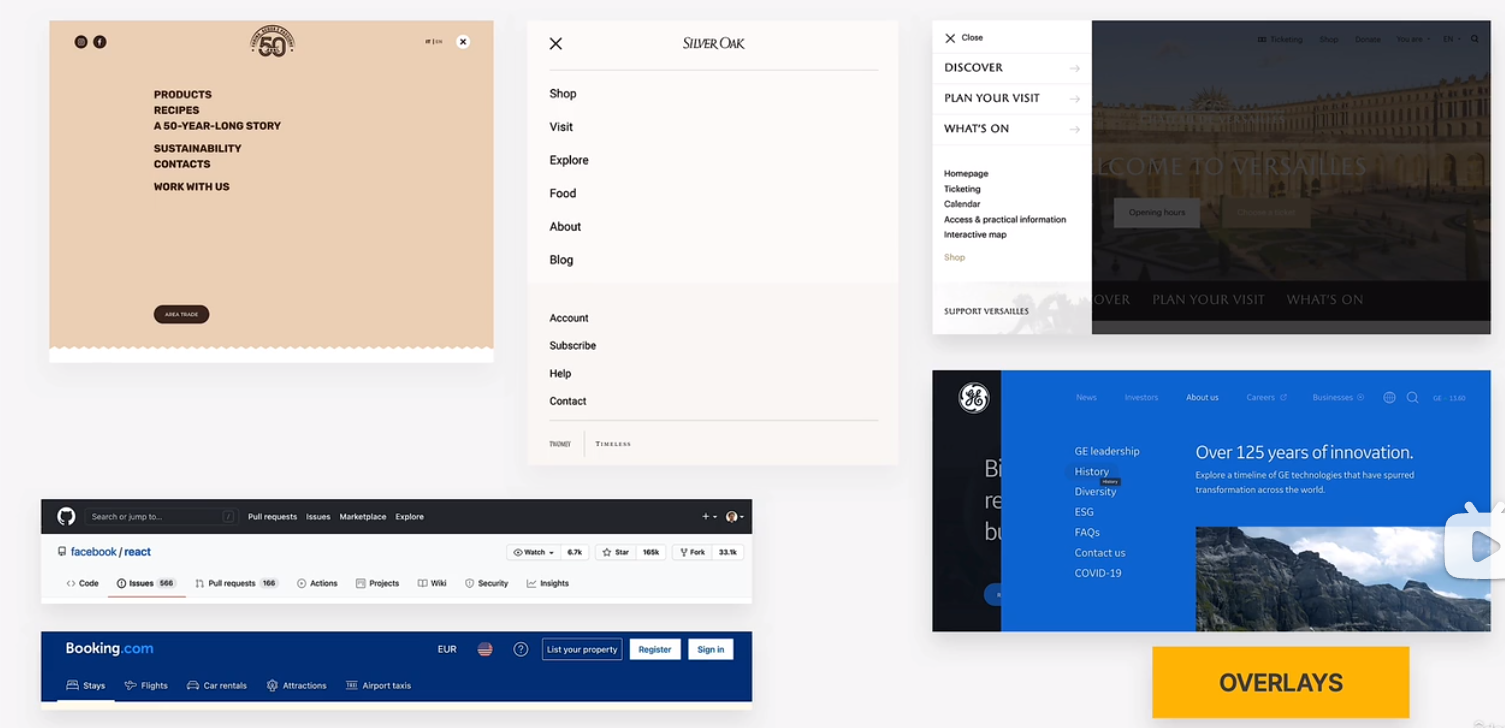
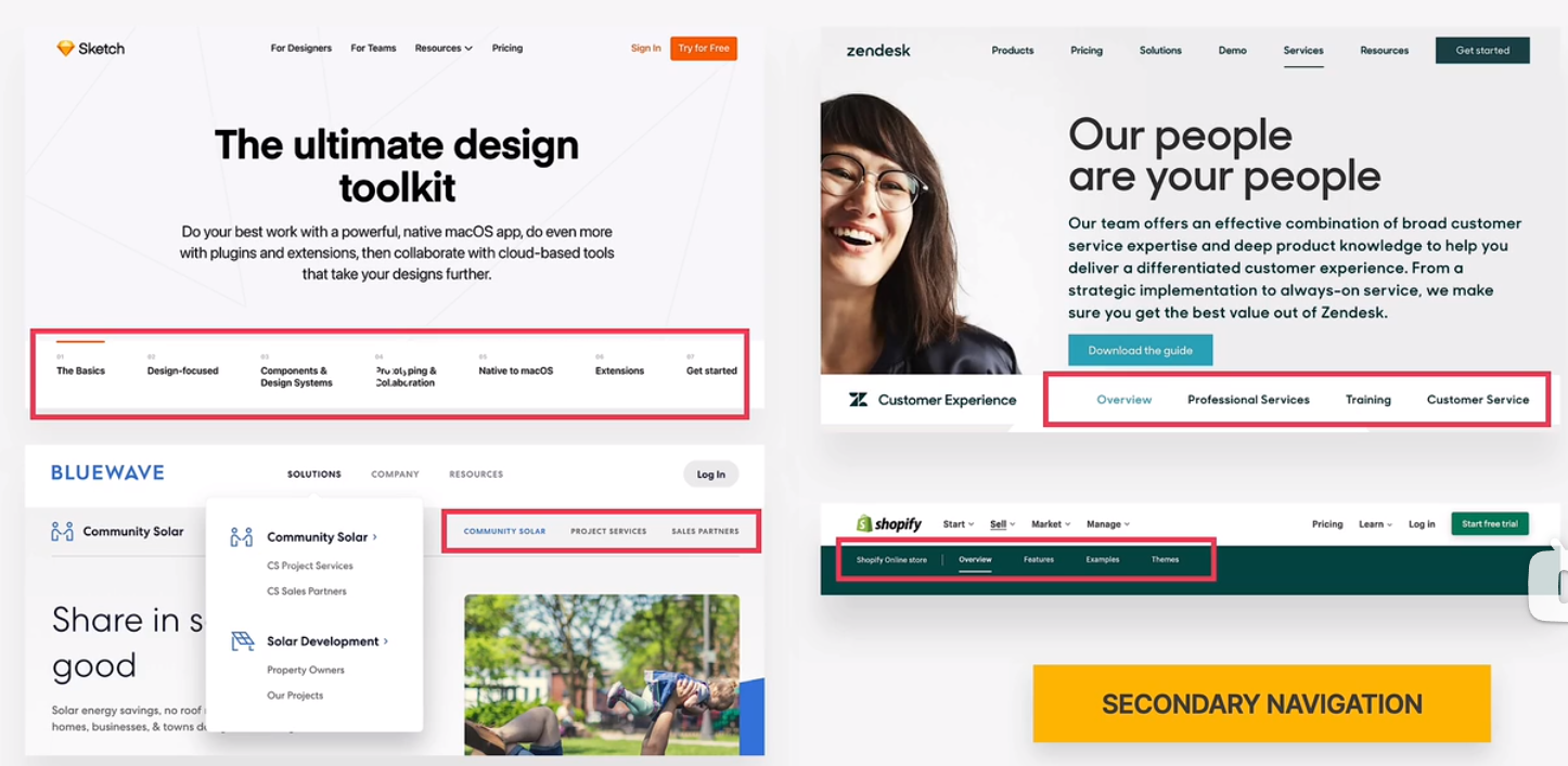
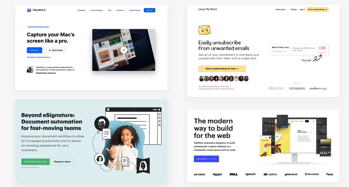
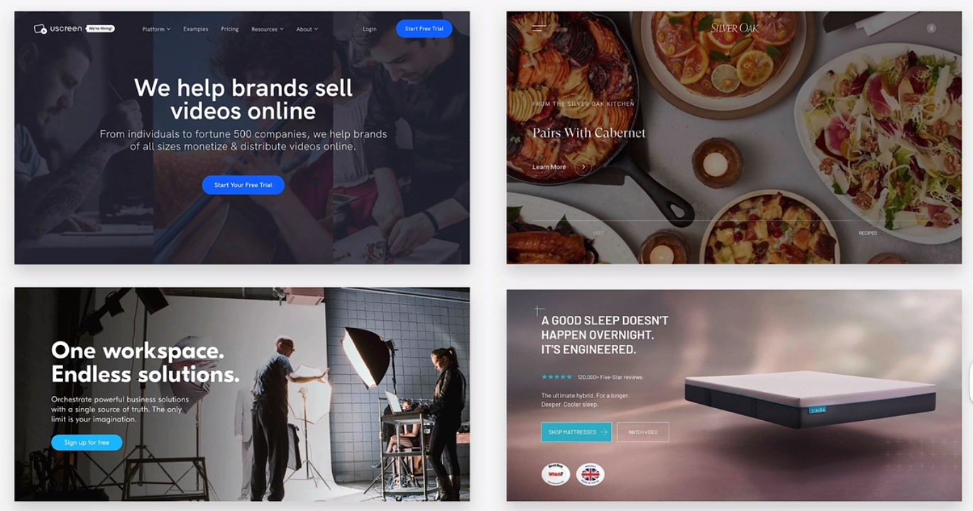
hero secttion
- type 1
text + image
text: header + description + botton
- type 2
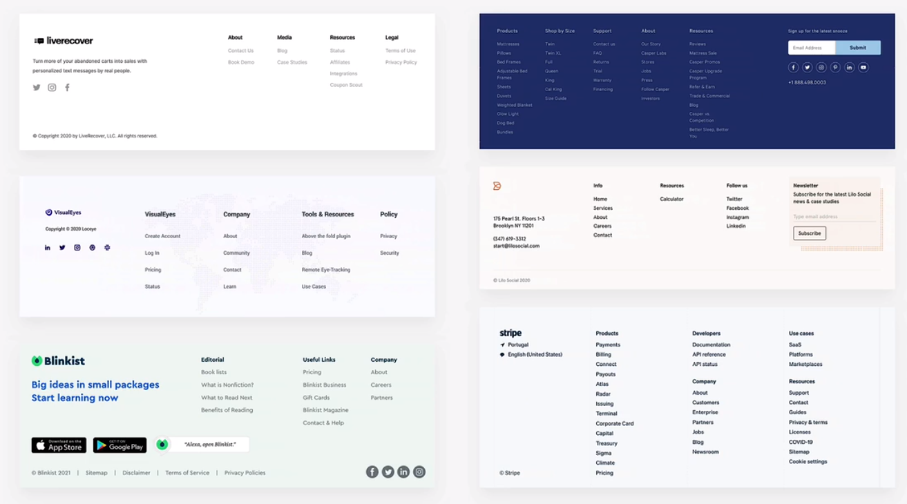
footer
- sitemap
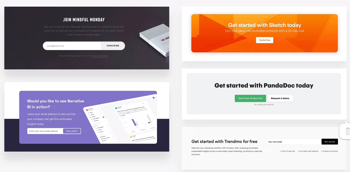
call to action section
contact us
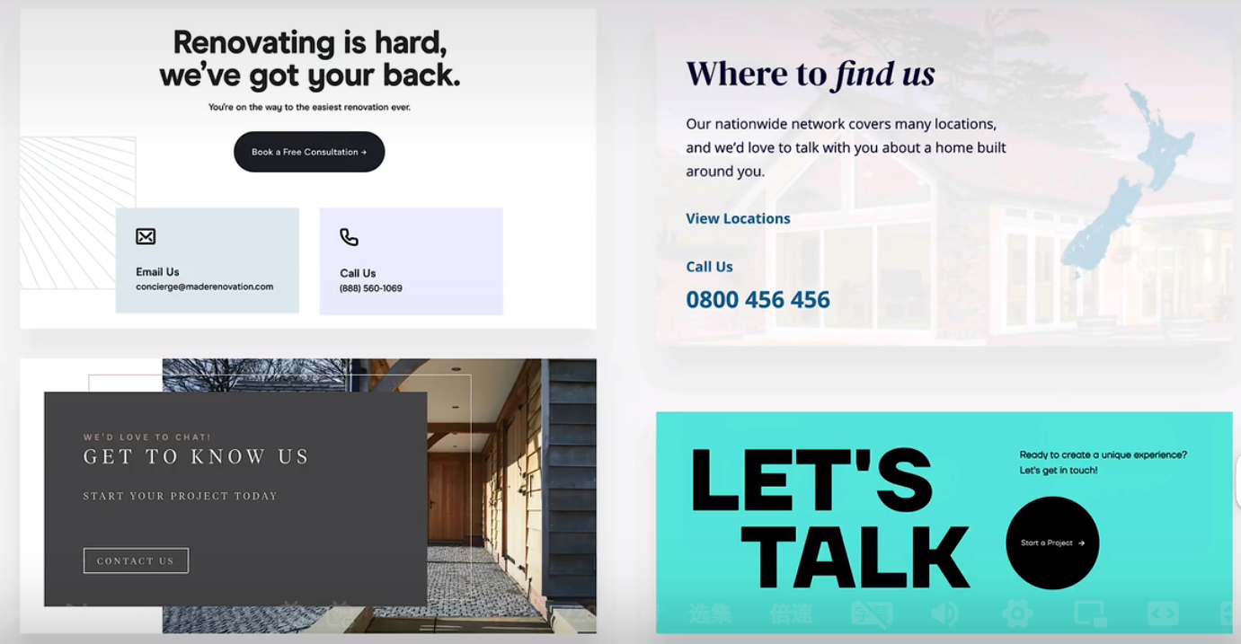
feature row
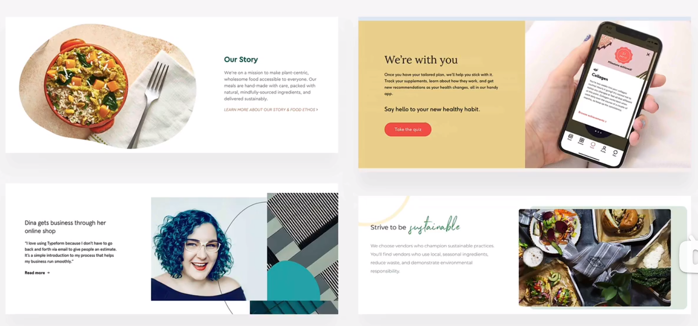
layout pattern
row of boxes/cards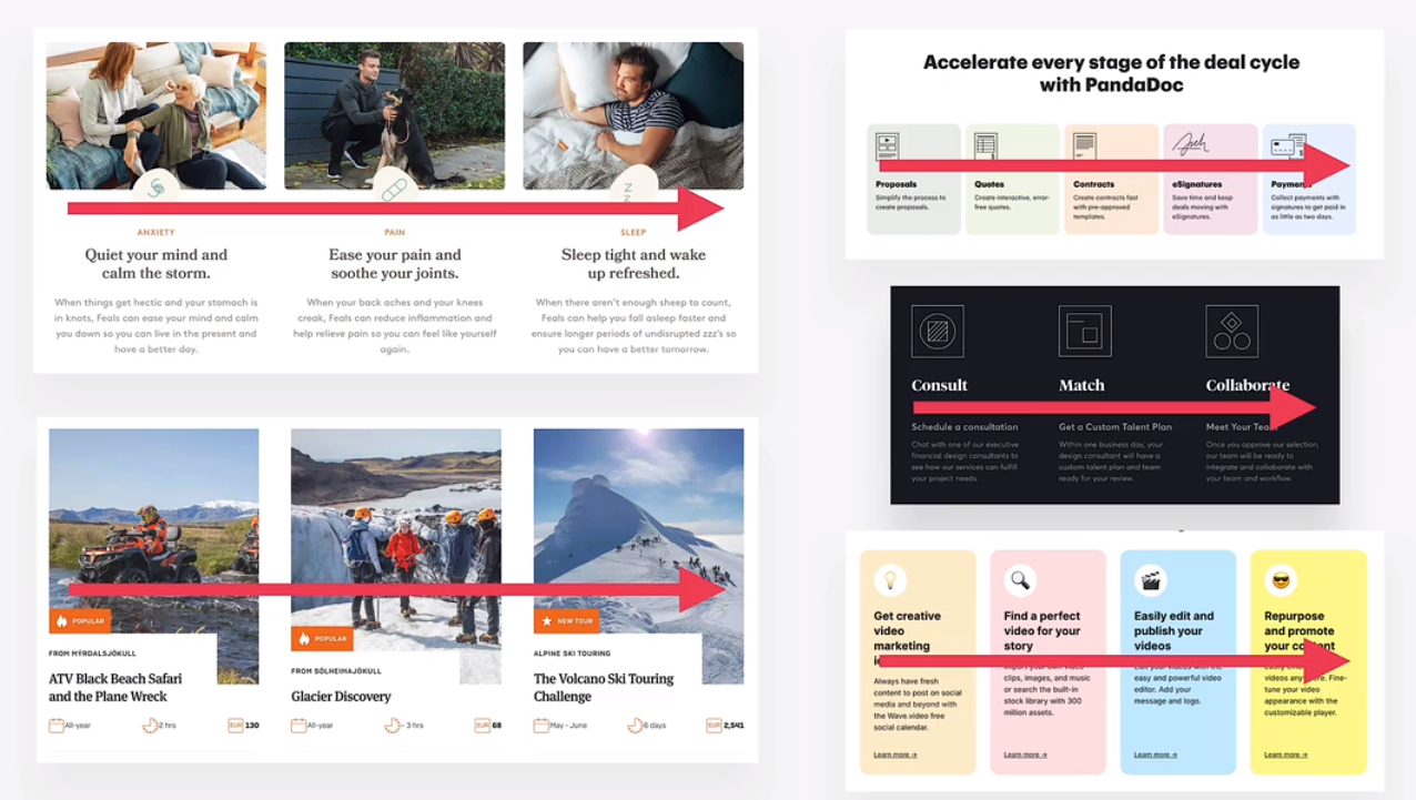
grid of boxes/cards
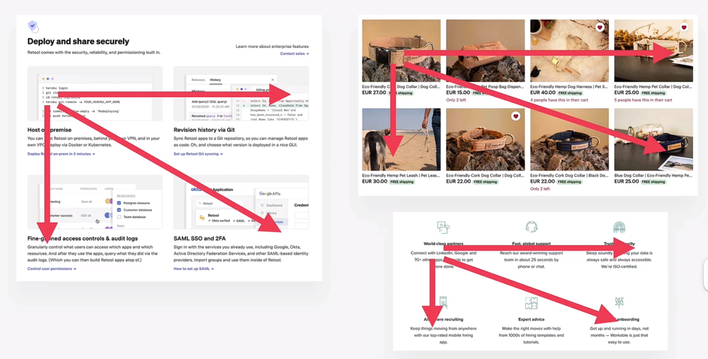
nesting patterns in components
z-pattern
f-pattern
single column
web app
side bar
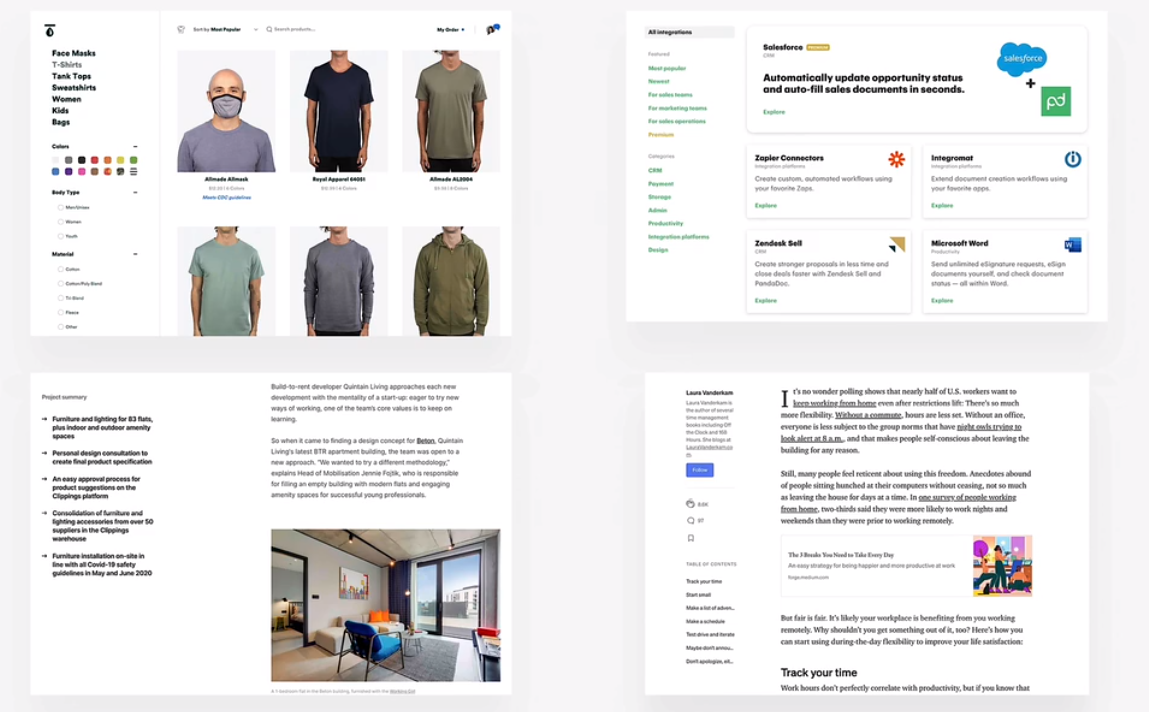
multi-column/magazine
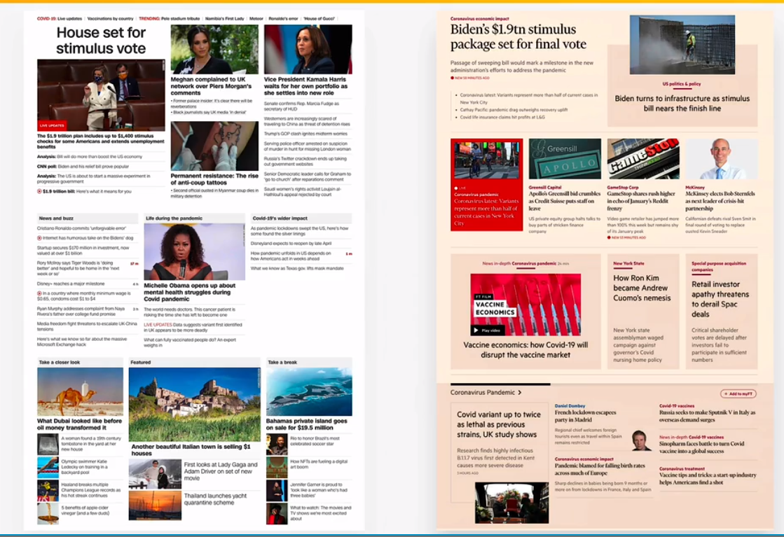
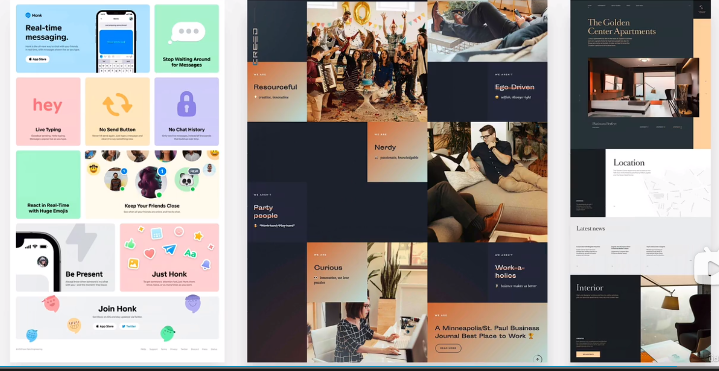
asymmetry/experimental
building a hero section - part 1
100vh viewport height
building a hero section - part 2
1 | background-image: url(hero.jpg); |
building a web application layout - part 1
building a web application layout - part 2
margin-left: auto;
how elements that dont fit into container appear
overflow: scroll;
omnifood project - setup and desktop version
7 steps
- define the project
define who the website is for. is it for yourself? for a client of your agency or your freelancing bussiness?
define what the website is for. in other words, define bussiness and user goals of your website project
bussiness goal examples: selling premium dog food
user goal example: finding high-quality dog food for good price
- define a target audience. Be really specific if possible and if it makes sense for your website
example: “weomen, 20 to 40 years old, living in europe, earning over 2000$/month, with a passion for dogs”
- plan the project
plan and gather website content: copy (text), images, videos etc.
content is usually provided by the client, but you also can help
for bigger sites, plan out the sitemap: what pages the site needs, and how they are related to one another(content hierachy)
based on the content, plan what sections each page needs in order to convey the contents message, and in which order
define the website personality
- sketch layout and component ideas
think out what components you need, and how you can use them in layout pattens
get ideas out of your head: sketch them with pen and paper or with some design software(e.g. figma)
this is an iterative process: experiment with different components and layouts, until you arrive at a first good solution
you dont need to sktch everything, and dont make it perfect. at some point, youre ready to jump into html and css
- design and build
use decisions, content and sketches from step 1, 2, 3
use layout and components to design the actual visul styles
create the design based on selected website personality, the design guidelines, and inspiration
use the client’s branding(if exists) for design decisions whenever possible: colors, typography, icons, etc.
- test and optimize
make sure website works well in all major browsers
test the website on actual mobile devices, not just in dev tools
optimize all images, in term of dimension and file size
fix simple accessibility problems
run the lighthouse performance test in chrome devtools and try to fix reported issues
think about search engine optimization
- launch the masterpiece
upload your website files to hosting platform.
choose and buy a great domain name, one that represents the brand well, is memorable and easy to write.
- maintain and keep updating website
install analytic software(e.g. google analytics or fathom) to get statics about website users. this myy inform future changes in the site structure and content.
a blog that is updated regularly is a good way to keep users coming back, and is also good for seo.
defining and planning the project
step 1
whe the website is for
for a client
what the website is for
business goal: selling monthly food subscrition
user goal: eating well effortlessly, without spending a lot of time and money
define target audience
busy people who like technology, are interesting in a health diet, and have a well-paying job.
step 2
sitemap: one page marketing website
define website personality
startup/upbeat
calm/peaceful
plan page sections
- logo + navigation
- hero
- featured in
- how it works
- meals(diets)
- testimonials + gallery
- pricing + feature
- call to action
- footer
sketching initial layout ideas
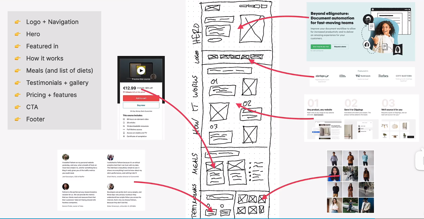
first design and development steps
responsive design principles
4 ingredients
fluid layouts
to allow webpgae to adapt to the current viewport width(or even height)
use %(or vh/vw) unit instead of px for elements that should adapt to viewport(usually layout)
use max-width instead of width
responsive units
use rem unit instead of px for most lengths
to make it easy to scale the entire layout down (or up) automatically
helpfull trick: setting 1rem to 10px for easy calculations
flexible images
by default, images dont scale automatically as we change the viewport, so we need to fix that
always use % for image dimensions, together with the max-width property
media queries
bring responsive sites to life
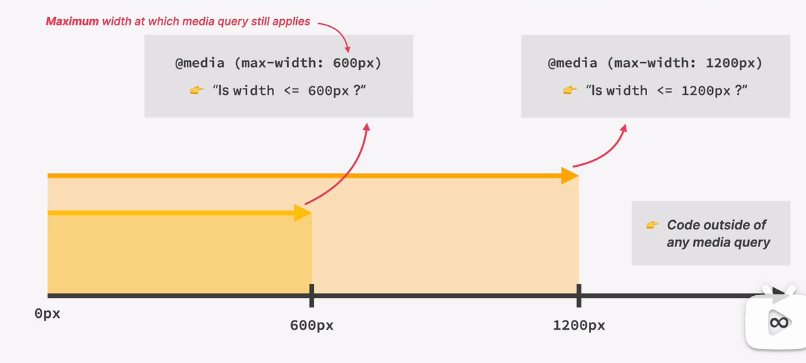
to change css styles on certain viewport widths(called breakpoints)
how rem and max-width work
max-width: 1000px
container > 1000px ->elements width = 1000px
container < 1000px ->elements width = 100% container width
可以和width: 30%; 合用
rem -> root element
default browser font size 16px
1 | html { |
building the hero - part 1
rarr: right arrow
building the hero - part 2
css default line height: 1.2
Normal: The default line height. If you’re using a desktop browser, the default is 1.2. However, this varies based on the element font family. Length: The length you identify is used to calculate line box height.
1 | /* trick to add border inside */ |
building the hero - part 3
building the website header
building the navigation
building how it works secton - part 1
building how it works secton - part 2
1 | .step-img-box::before { |
z-index: -1;
building the featured-in section
1 | img { |
building the meals section - part 1
building the meals section - part 2
overflow: hidden;
building the meals section - part 3
currentColor
the text color
1 | .link:link, .link:visited { |
building the testimonials section - part 1
1 | .section-testimonials { |
building the pricing section - part 1
building the pricing section - part 2
building the feature part
1 | .feature-icon { |
building the call-to-action section - part 1
background-image: linear-gradient(90deg #e67e22, #eb984e);
background-image: url(../img/eating.jpg);background-size: cover;background-position: center;
background-image: linear-gradient(to right bottom, rgba(50, 50, 49, 0.35), rgba(235, 150, 76, 0.35)), url(../img/eating.jpg);
building the call-to-action section - part 2
font-family: inherit;
building the footer - part 1
building the footer - part 2
responsive design
how media queries work
1 | /* hero section */ |
how to select breakpoints

responding to small laptops
<meta name="viewport" content="width=device-width, initial-scale=1.0" />
rem and em do not depend on html font-size in media queries
Instead 1rem = 1em = 16px